Blog
Product Updates
The latest updates and improvements to the Visible application.
All
Fundraising Metrics and data Product Updates Operations Hiring & Talent Reporting Customer Stories

founders
Hiring & Talent
Operations
Product Updates
Leaders Have Been Taking Communication Seriously
Naturally, communicating when times are tough is intimidating. No one likes to share what is potentially bad news. However, when times are tough it is more important than ever for leaders to communicate with their stakeholders.
Loads of VCs and founders have written about the importance of communication during a crisis over the past few weeks:
“First [of six disciplines for challenging times], transparent communication… There is no better example than Winston Churchill. As you articulate communication plans, speak with transparency, candor, and gravity.” — Tomasz Tunguz in Six Startup Disciplines for Challenging Times
“When people get Happy Talk instead of Hard Talk, it doesn’t reassure them. In fact, it does the opposite: It causes them to question the credibility of their leaders, which heightens their anxiety and makes them feel rudderless.” — David Sacks in Happy Talk Versus Hard Talk
“Culture should be a priority. And today it is more important than ever. For the amount of time we spend working it should be positive, enjoyable, challenging in a good way and everyone there should feel connected to the company. Happy people make for happy atmospheres regardless of the hard work being done.” — Joanne Wilson in Culture is Important Now More Than Ever
“Communicate, communicate, communicate. It is even more important in a remote environment.” — Seth Levine in Tips For Working from Home From The Foundry Network
“Regardless of the times, entrepreneurs should send a weekly email update to their constituents — employees, advisors, mentors, and investors. People want to know what’s going on. People want to help. Regular email communication is the most repeatable, and scalable, method.” — David Cummings in Weekly Communication
“Key learnings – a) understand and optimize your cash position b) increase communication with team, investors and customers. More the better. c) organize around your customer – shift resources to help them. d) look for opportunities that others won’t see e) stay optimistic!” — Scott Dorsey on Key Learnings from Leading Through 2008 Crisis
Everyone can come out and say that now is the time to communicate but that does not mean everyone will do so. Communicating when times are tough is easier said than done.
Considering our bread and butter is investor and stakeholder communications, we decided to take a look at our data and see if leaders are in fact stepping up during these tough times. The results? Startups and leaders and taking communication incredibly seriously.
First, we took a look at Update recipients by month:
This chart is simply the total number of Update recipients by month. Clearly March has been our best month to date. It is refreshing to see leaders and founders doubling down on communication. So how are the recipients receiving the Updates?
Very well. The chart below is number of Update Reactions, our version of a thumbs up/like, by month:
The result? Investors, team members, and other stakeholders are trying to be as supportive as possible. It is incredible to see leaders double down on communication and their stakeholders pass along support.
Leaders who can step up now will ensure that their team, investors, and other stakeholders are at ease. Plus, they’ll position themselves for success when we get through the current crisis. As Naval Ravikant wrote, “Leadership in the coming months, at every level, is the audition to lead in the coming years.”
If you are ready to get an Update out to your investors or team, start your Visible trial here.
investors
Product Updates
Investor Platform Updates – Reports, Advisor Roles and Custom Properties
The Visible team has been hard at work on our investor platform. Check out the updates below.
Over the next 6 weeks we will be rapidly rolling out new functionality — stay tuned! Our team is happy to jump on a quick call or demo to walk you through the latest changes and answer any questions. Schedule your demo today!
Reports
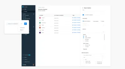
Our new report builder allows you to create and save reports for your portfolio. Reports will provide instant insights into company performance and custom views — great for weekly meetings!
In our initial release, reports can include:
Metrics
Metric Insights for changes between periods — % and actual (WoW, MoM, QoQ and YoY)
Custom Properties
Request Metadata
Sorting
Advisor Roles
Want to share specific portfolio companies with advisors, mentors or individuals that work closely with your portfolio companies but don’t want them to get full access? Advisor Roles are a perfect fit for you!
Custom Properties
Custom properties are now live in the UI. In your portfolio click the secondary dropdown and create custom properties for your portfolio.
Properties can include:
Numbers
Percentages
Currencies (Full currency support)
Dates
Short/Long Text
Dropdowns
URLs
Revamped Portfolio Company Metrics
We re-architected how company metrics are created and handled. Metrics can be assigned to all companies or on a per-portfolio company basis giving you ultimate control and customization.
Want to learn more? Schedule your demo today!

founders
Product Updates
Introducing the new Home section
You may have noticed a new addition to the Visible application if you have signed in lately. We recently launched the Home section.
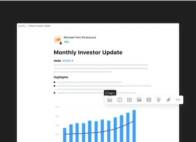
The Home section provides an activity feed to show you exactly who is engaged with your Updates, Dashboards and other content. In this first version we’ll provide:
Views of Updates (from an email or link)
Clicks on Updates
Reactions to Updates
Views of Dashboards
Your feed will also smartly group items together based on time and the activity type.
Home also provides quick actions to see your recently sent Updates, edit existing Update drafts, and the ability to start a new Update from scratch or a template.
We’re excited to provide even more activity types as we launch new ways to engage with your investors and stakeholders.
Engaged Investors
Engaged Investors = Startup Success.
When startups produce regular investor Updates and prioritize investor reporting they create an unfair advantage of being top of mind. The Home section helps understand which of your investors are engaged, value-add and in the loop.
When companies are top of mind they get the benefit of customer introductions, partnership introductions, follow-on capital, help with hiring and more.
This is just the start with the new Home & Activity Feed. We’re excited to provide more insights on how to engage your stakeholders for success.
Up & to the right,
-Mike & The Visible Team
founders
Product Updates
It’s live! Update Editor 2.0
Introducing Our New Update Editor
Updates are the core of the Visible product. It’s no secret that we believe that regular investor updates are a key component of startup success and raising follow-on funding. We want to continue to be the best way to build and send your investor updates, which is why we’ve released our Update Editor 2.0.
With our newest release, writing Updates is quicker and easier than ever before. In addition to a UI facelift, we’ve also added features that are as functional as they are fun to use. Here are a few of the things you can do with our Update Editor 2.0:
Move and organize text, objects, charts and images easily with universal drag-and-drop
Get a clean, professional look with side-by-side charts
Use new blocks to add charts, tables, files, text and images anywhere in your update
Drop local files and images directly into your update
Split your update into sections with line breaks
To see the new Editor in action, you can check out this short video:
These improvements also pave the way for some exciting new features we’re currently working on. We can’t wait to share them with you!
The Update Editor 2.0 is live in the product now. If you’re a Visible customer, sign in and check it out. If you’re not a Visible customer yet, we’d love to offer you a free 14-day trial so you can check it out for yourself.
founders
Metrics and data
Product Updates
QuickBooks Integration Improvements
QuickBooks Chart of Accounts & More
Getting your key metrics, custom financials and business data out of QuickBooks Online just got a whole lot easier. Our product team (special thanks to Eugene) just released a stellar improvement to our existing QuickBooks integration.
Our improved integration will pull data from your Profit & Loss Statement, Balance Sheet and Statement of Cash Flows. We will sync any headers, sub-headers and specific accounts that are unique to your business.
Once connected, the headers will unfurl and you’ll be able to customize which metrics you’d like to pull in along with the headers themselves.
If you’re already using our QuickBooks integration, simply edit your current connection and we’ll display all of the new metrics that you can sync.
For new users, just connect to QuickBooks as a new integration.
We find that most customers love using our formula builder and variance reporting to mash up their QuickBooks data alongside forecasts, budgets, and data from other sources.
We hope you love our new QuickBooks functionality. If you have any questions, make sure to contact us or check out our knowledge base for any support-related items.
Up & to the right,
Mike & The Visible Team

founders
Product Updates
Reactions, Update Template Library, and More
This month we’ve brought you product improvements that are all about making your Updates better. Check out what’s new from the last month below.
Reactions to Updates
We all like to know that the work we put into updates is appreciated. Reactions make it easy to know when your stakeholders have engaged with your update. With reactions, recipients can simply give your Update a thumbs-up.
Reactions are currently in beta, if you’re interested in having Reactions enabled for your account, send us an email to hi@visible.vc.
Update Template Library
Not sure what to include in your next Update? We’ve got your back with our new Update Template Library.
We are in early stages of building out our Update Template Library. Add any template to your account with the click of a button. Check out the library here. Have a template you’d like to share? Shoot us a message to marketing@visible.vc
Check out the Library >>>
Tables in Updates
The same tables you use in Dashboards can now be used in Updates! What seems like a simple feature from the outside was actually a complex user experience to nail.
Feel free to contact us with any feedback or questions you have!
Up & to the Right,
-Matt & The Visible Team
founders
Product Updates
Updated Navigation + Tables in Updates
If you sign into Visible today, you’ll see an updated navigation. The changes we’ve made are small, but they will accomplish a couple key items:
Make drafting, editing and sending Updates easier than ever
Set the stage for some game-changing improvements & features to be delivered later this quarter.
What, exactly, is changing?
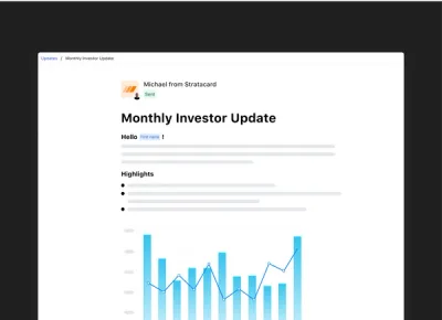
Update drafts are now in the sidebar. Instead of a couple clicks to get into an Update, you’ll be able get there with much more ease.
We’ve fixed Settings, Metrics and Contacts to the bottom of the sidebar. We’ve also created a specific Sent Updates navigation item to quickly see the Stats of your previously sent Updates.
Our aim was to have anything you are frequently creating, viewing or editing to be prominent, near the top of of the navigation, while features that you interact with less frequently to be positioned at the bottom.
Tables—better late than never?
The same tables you use in Dashboards can now be used in Updates! What seems like a simple feature from the outside was actually a complex user experience to nail.
The team rallied and launched this feature, which many of you have requested. Thanks to Eugene (who is new on our product team) for tackling this!
Feel free to contact us with any feedback or questions you have!
Up & to the Right,
-Mike & The Visible Team
founders
Metrics and data
Product Updates
Salesforce Updates – Contacts & Accounts
Contact and Account Objects in Salesforce
The Visible product team just updated our Salesforce Integration. We now support the Contacts and Accounts objects in addition to the already existing Leads and Opportunities objects.
If you need a refresher on Salesforce, you can read more in our knowledge base. Contact us to send us any feedback or questions.
Up & to the right,
-Mike & The Visible Team.

founders
Product Updates
Personalized Updates, New Text Editor & Improved Readability
Our Improved Investor Update Editor
We’re thrilled to announce two new design & UX improvements to the core Visible experience. Starting today, Updates can be addressed to respective recipients. These are commonly referred to as “merge tags”, and you can use them to personalize an Update with a recipient’s first name, last name and email.
Simply highlight the text you want to personalize and click the “tag” icon and choose the field you want to include. We will populate the fields based on the names set in your Contact Lists & Users section. If a field happens to be blank, you can include a fallback value.
Merge tags are being powered by an all new text editor and writing experience! In addition to giving us a great platform for new features, the overall experience should be much more pleasant. This new text editor is turned on by default for all new users; current customers can email beta@visible.vc and we will enable this for you prior to the full migration.
We have also changed the typeface used across the application. Instead of seeing the Whitney font which we’ve been using in our application for over 2 years, you’ll now see your default system font. (On Mac and iPhone, you’ll see the San Francisco typeface, on Windows Vista it will be Segoe UI, and on Android you’ll now see Roboto). This font will likely be familiar to you already as it’s currently used natively by your respective OS and more and more frequently on many major web applications. This change will create a faster and more cohesive experience not only within the Visible application, but also in Update emails that are published via Visible.
Please send any and all feedback our way!
Up & to the right,
– Ciarán & The Visible Team
founders
Metrics and data
Product Updates
Using Variance Reporting in Visible
Use Variance Reports to Determine How You’re Tracking to Your Projections
How are we doing? Are things going to plan? Are we overspending? Underspending? Where should we double-down? Cutback?
These are all questions that you’ve likely encountered in a management meeting or recent board meeting.
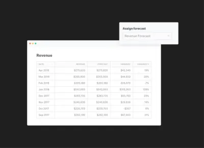
Today we are excited to announce new Variance Report module that will be part of our insights layer. Variance reporting will let our customers quickly assign any of their KPIs to a forecasted or budgeted value and with one-click get back a full Variance Report.
We’ll calculate the following in your Variance Report:
MTD Variance
MTD Variance %
YTD Actual
YTD Variance
YTD Variance %
YTD Actual
prior yr YTD Actual
prior yr YTD Variance
prior yr YTD Variance %
Our budget vs actual and variance reporting will give you instant insights and reporting capabilities for any of your metrics in Visible. Being able to make timely decisions based on your forecasts and budget will help accelerate growth, manage your bottom line and hit goals across your organization. Utilizing the variance report in Visible is great for:
Weekly team updates showing progess towards your Monthly and Annual Goals
Crafting monthly management reports to your leadership teams providing feedback on where you under/over performed
Creating pre-board meeting reports that give a health check on where you are compared to board approved budgets.
We hope you enjoy! Sign in to Visible to get started to or sign up! Feel free to email support@visible.vc with any questions, comments and feedback.
Up & to the right, The Visible Team

founders
Product Updates
Your New & Improved Data Section
The Visible team recently pushed changes to the data section to provide more insights, context and usability.
We’ve broken down the data section into a couple of key components.
Experience Improvements
With just a single click you can automatically generate a chart for any metric. You’ll have the option to return to the data section to create additional metrics or you can go to the respective dashboard and continue to edit the chart.
Insights
With just a few clicks, you’ll be able to see the following metrics that we automatically calculate for you:
Growth % – the change from the previous year
Previous Year – the value for the same metric one year prior
Previous Year Change – The % change for the same metric from the previous year
Total – The cumulative total for all the values of a given metric
3 Period Rolling Avg. – The rolling average for the previous 3 periods.
6 Period Rolling Avg. – The rolling average for the previous 6 periods.
12 Period Rolling Avg – The rolling average for the previous 12 periods.
Frequencies
We will automatically roll data up to different frequencies. E.g. if you are bringing in daily data, you’ll be able to view it as:
Daily
Weekly
Quarterly
Annually
Metric Settings
This is where you can set the type of metric, the default color for your charting needs, description and any other pertinent settings for the metric.
We’ll be updating data connections and the chart builder in the near future to provide an ever more seamless workflow. As always ping hi@visible.vc should you have any questions or feedback.
Up & to the right,
-Ciarán & The Visible Team

founders
Product Updates
Year over Year Metric Comparison
Great metrics share the same traits. Two of the most important traits are making sure your metrics are comparative & a ratio/rate.
The Visible team just pushed a great update to make it even easier to compare your key metrics to a previous year along side the % change from the previous year. Want to jump right in? Check out our Year-over-Year Knowledge base article.
A year may seem like a lifetime in a high-paced environment but it’s important benchmark yourself to where you were the prior year. It’s especially useful to take a breath and give your leadership team a chance to make informed, strategic decisions.
We love inspiration (aka copying great work) on the Visible team so wanted to share some great ideas you are welcome to use for yourself.
Revenue vs Prior Year
This is a great way to quickly see where your KPI is currently, where you were the previous year and what is the delta from the previous year. Charting the % Change on the opposing axis lets you quickly see the good (or bad).
In the example above you can see 2018 is off to a great start with major gains from the previous year.
Revenue & Forecast
The first example is a good but what were the expectations for a particular KPI? Did we over-perform? Under-perform? Just squeak by?
This example lets you quickly understand the business is over-performing (yes!) and what we expect for the next quarter.
Want to know more about what makes a good metric? Check out this post by Plan Brothers and this one by OnStartups.
Want some help getting these setup in your Visible Account? Just email our data team at hi@visible.vc.
Up & to the right,
-Mike & The Visible Team
founders
Product Updates
Slack Your Updates
Send Investor and Team Updates in Slack
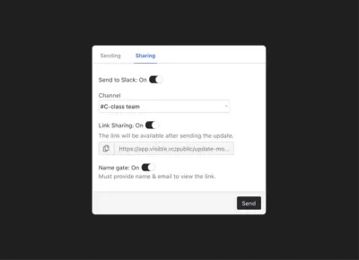
Today we are launching our Slack integration into beta! You’ll be able to publish Visible Updates to any of your Slack channels in addition to other current publishing methods (email, PDF, shareable link).
We’ll show a preview of the Update text and the first chart or image in your Slack channel with a link to view the rest!
Instantly collaborate with your team member and other stakeholders in your Slack channel around any of your Updates.
Looking for some inspiration?
Send your True North Metric to your company wide channel to show progress towards goal with commentary.
Show your #sales channel how you are pacing for the current period.
Visualize your ARR movements to keep the entire company on the same page.
Stay tuned as this is just the beginning for our Slack integration!
Up & to the right,
Mike & The Visible Team
founders
Product Updates
Visible Now Integrates With 1,000 Other Products
We know that getting your work done requires many different web tools. In fact, the average business uses between 10 and 16 apps. You have your email app, CRM, note-taking tool, cloud storage tool, team communication app, along with project management tools and various to-do lists. Sometimes, it can be a struggle to get them all working in tandem. Now that Visible has 1,000 integrations, you can choose your favorite tools and easily integrate them with Visible.
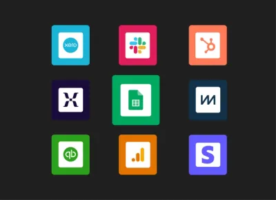
Visible now connects to 1,000 other web tools, thanks to our Zapier integration. With workflow automation tool Zapier, you can set up your own codeless integrations called “Zaps”. Zaps will automatically send information from one tool to another, so you’ll spend less time manually transferring data between your business tools and can dedicate more focus to creative, big picture tasks.
Boost Your Productivity with Popular Visible Integrations
No matter what other apps you use, chances are Visible integrates with them via Zapier. Here are some of the most popular integrations that Visible users already use to be more productive.
The New Year is the perfect time to evaluate your processes and find ways to boost productivity. Check out some of the Visible Zap’s here.

founders
Product Updates
How and Why We Changed Our Onboarding
Intro
User Onboarding is one of the most challenging aspects of product design. Approaching the task of how can we improve our onboarding experience can end up involving an evaluation of the entire product offering and the messaging around it (including but not restricted to all marketing material, ads & search results in google, your website, and it of course runs right through your product.)
The latest part of our user onboarding experience we recently undertook evaluating was the first run in product experience. This was our third attempt at tackling it. From our research we’ve seen that we’re not alone in the struggle to get this right. A look across the blogs of many other products will show blog posts about onboarding experiences which have since been overhauled completely. It’s clear there is no one perfect onboarding technique and a successfully onboarded user is a difficult thing to measure. From out latest effort however, we’ve seen some exciting results and we’ve got some great feedback and questions so far so we decided to share a little insight into what led us to out current solution.
Just saw your new product update re: the contextual help guide. Great feature! Did you guys build this inhouse or use a tool to develop it?
Just read your blog post on your new help guide–I like the way you tackled that! Did you build that custom or use a product to provide contextual help?
The Problem
Our previous iterations focussed on a very particular and direct path towards what we considered to be an onboarded user within our own product. We established after which actions our users were most likely to become paying customers by looking at the statistics. We tried to then work out the shortest path to that point to create an onboarding experience that would get them to that ‘aha’ moment in one run. We tried two different approaches to this. Both with varying levels of success. It was clear that users were taking more actions within the product, but we weren’t seeing an increase in conversions to paying customers – or certainly nothing we could confidently attribute to our new onboarding experience. If anything, it was actually muddying the stats with regards to actions taken within the product because it was unclear how motivated these actions were, and whether users were seeing real value at the end of it.
We decided to take a step back and to scrap our previous concept of what we considered an onboarded user. We weren’t disregarding those main actions as a primary driver of adoption, but it was clear that the decision to convert didn’t come as easily as completing three steps and handing over the credit card details. The reasons that may cause one user to convert to a paying customer may not be the same for the next user. While their goals will be similar, there are different aspects of our product that can serve to help our users achieve them and the clinching moment for each user can be quite different.
We wanted to create a first run experience that better showcased our product and the things it can do, rather than getting our users to fulfil a specific number of actions. We also wanted to find a method that didn’t hinder the overall user experience by forcing the users down paths they may not want to go initially. We wanted to design a less intrusive onboarding experience, but one that still ensured our users didn’t get lost or give up before seeing the value of our product and came away having a very good sense of how Visible could help them achieve their goals.
Our users were converting once they’d had a chance to explore Visible, to see it’s wealth of features, it’s simplicity and ease of use and most often, for how quickly they could create data rich, beautiful updates. We were confident we could remove our previous onboarding walkthrough and we could leave users in our product with no help and almost all will figure out the main actions within our product. However, what they might not see in a first run experience is the wealth of other rich features in our product that are deliberately a little less obvious initially. The nature of our product means we have a lot of features, some complex, some simple. We wanted a way to showcase these features and offer direction for future actions, but not insist right off the bat.
The Solution
What we came up with was the Visible Help Guide. The idea was that it would be contextual and show the right information at the right time. It would be unobtrusive and only offer help when help was asked for and get out of the way when it was not needed. It would be adaptive and help each user progress in the direction they wanted to take and not through a set of predefined steps that we had decided for them.
In order for it to be contextual we ensured it was wired up to the relevant sections of our product so that when it was opened, it would first show help content relevant to that specific area of the product. If it was requested at first (we ask them how they’d like to explore Visible at the beginning), it would pop out when a user first visited an area of the product with relevant help and suggestions for that section. It would then also offer a quick overview of everything they could do from within that section and as a result gave an insight into the wealth of features available in Visible without overwhelming or insisting they complete them in a first run.
The result is a clever resource that will grow with our product and acts as a reference for everything that can be done within Visible. It offers guidance to new users to get started and prompts for next actions without insisting, and it also acts as a useful reference for more experienced users to ensure they’re getting the most out of Visible and to uncover some features that they may not have been using previously.
The response has been extremely positive. We’ve seen a 30% increase in Product Qualified leads coming through since we implemented our new guide! (Learn more about PQL’s here). We’re seeing more actions being taken within the product than our previous onboarding experiences and our users are taking these actions themselves. It’s also helped to reduce the number of requests coming into our customer support team for queries on how to perform specific actions as our users can now get help from within the app and also have an easier way to find our knowledge base in Intercom. We’re sure there will be future iterations on what we currently have but the results so far have been very positive and we finally have something to build on.
Unlock Your Investor Relationships. Try Visible for Free for 14 Days.
Start Your Free Trial