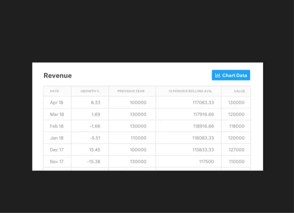
The Visible team recently pushed changes to the data section to provide more insights, context and usability.
We’ve broken down the data section into a couple of key components.
Experience Improvements
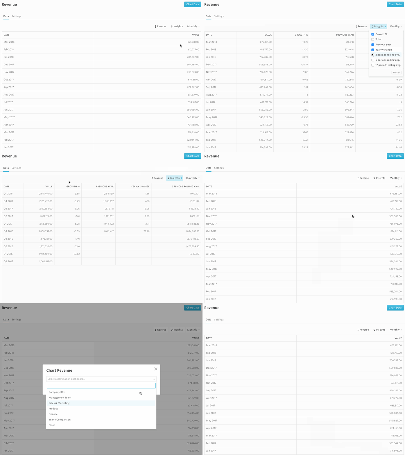
With just a single click you can automatically generate a chart for any metric. You’ll have the option to return to the data section to create additional metrics or you can go to the respective dashboard and continue to edit the chart.
Insights
With just a few clicks, you’ll be able to see the following metrics that we automatically calculate for you:
- Growth % – the change from the previous year
- Previous Year – the value for the same metric one year prior
- Previous Year Change – The % change for the same metric from the previous year
- Total – The cumulative total for all the values of a given metric
- 3 Period Rolling Avg. – The rolling average for the previous 3 periods.
- 6 Period Rolling Avg. – The rolling average for the previous 6 periods.
- 12 Period Rolling Avg – The rolling average for the previous 12 periods.

Frequencies
We will automatically roll data up to different frequencies. E.g. if you are bringing in daily data, you’ll be able to view it as:
- Daily
- Weekly
- Quarterly
- Annually
Metric Settings
This is where you can set the type of metric, the default color for your charting needs, description and any other pertinent settings for the metric.
We’ll be updating data connections and the chart builder in the near future to provide an ever more seamless workflow. As always ping hi@visible.vc should you have any questions or feedback.
Up & to the right,
-Ciarán & The Visible Team


