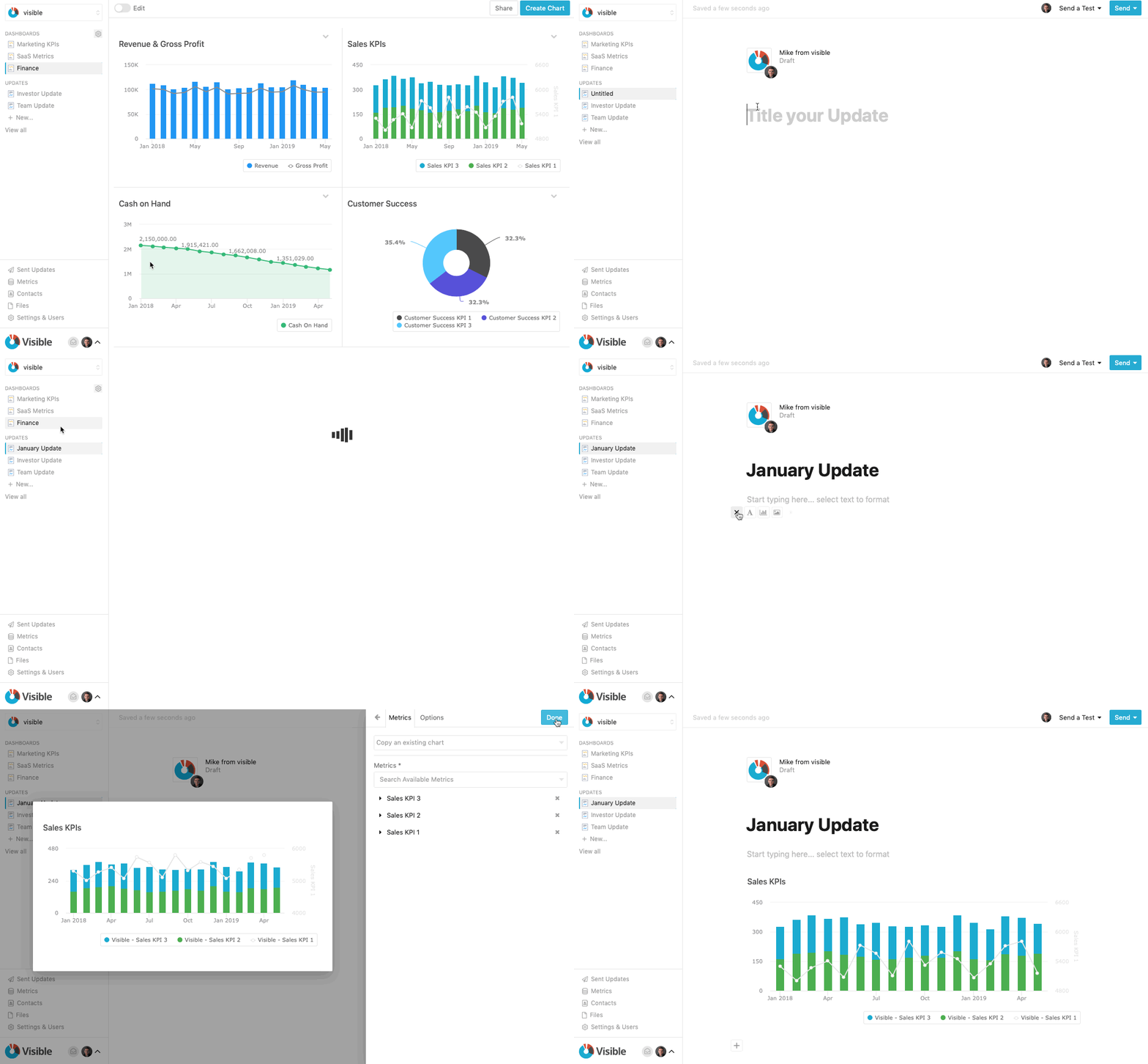
If you sign into Visible today, you’ll see an updated navigation. The changes we’ve made are small, but they will accomplish a couple key items:
- Make drafting, editing and sending Updates easier than ever
- Set the stage for some game-changing improvements & features to be delivered later this quarter.
What, exactly, is changing?
Update drafts are now in the sidebar. Instead of a couple clicks to get into an Update, you’ll be able get there with much more ease.
We’ve fixed Settings, Metrics and Contacts to the bottom of the sidebar. We’ve also created a specific Sent Updates navigation item to quickly see the Stats of your previously sent Updates.
Our aim was to have anything you are frequently creating, viewing or editing to be prominent, near the top of of the navigation, while features that you interact with less frequently to be positioned at the bottom.

Tables—better late than never?
The same tables you use in Dashboards can now be used in Updates! What seems like a simple feature from the outside was actually a complex user experience to nail.
The team rallied and launched this feature, which many of you have requested. Thanks to Eugene (who is new on our product team) for tackling this!

Feel free to contact us with any feedback or questions you have!
Up & to the Right,
-Mike & The Visible Team


