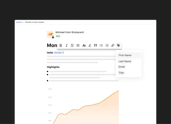
Our Improved Investor Update Editor
We’re thrilled to announce two new design & UX improvements to the core Visible experience. Starting today, Updates can be addressed to respective recipients. These are commonly referred to as “merge tags”, and you can use them to personalize an Update with a recipient’s first name, last name and email.
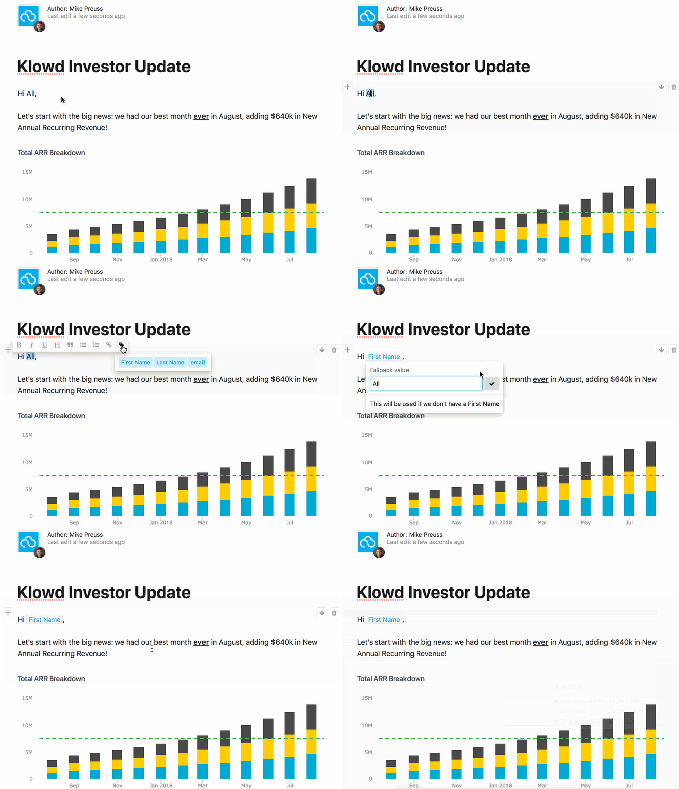
Simply highlight the text you want to personalize and click the “tag” icon and choose the field you want to include. We will populate the fields based on the names set in your Contact Lists & Users section. If a field happens to be blank, you can include a fallback value.
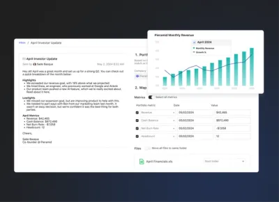
Merge tags are being powered by an all new text editor and writing experience! In addition to giving us a great platform for new features, the overall experience should be much more pleasant. This new text editor is turned on by default for all new users; current customers can email beta@visible.vc and we will enable this for you prior to the full migration.
We have also changed the typeface used across the application. Instead of seeing the Whitney font which we’ve been using in our application for over 2 years, you’ll now see your default system font. (On Mac and iPhone, you’ll see the San Francisco typeface, on Windows Vista it will be Segoe UI, and on Android you’ll now see Roboto). This font will likely be familiar to you already as it’s currently used natively by your respective OS and more and more frequently on many major web applications. This change will create a faster and more cohesive experience not only within the Visible application, but also in Update emails that are published via Visible.
Please send any and all feedback our way!
Up & to the right,
– Ciarán & The Visible Team
