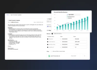
Charting Your Xero Data Using Dashboards
This release is packed with a lot of great functionality so “Hold on to your butts”, as close confident Samuel L Jackson would say.

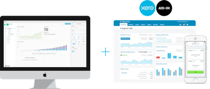
First up. We just launched our Xero Integration. Easily connect to your Xero account and we will automatically pull TEN metrics from your Profit & Loss report and Balance Sheet. Start building beautiful Xero Dashboards in seconds!
That brings us to — Exporting: We constantly hear, “How can I print my screen?”…or “Is there an easy way to put my charts in a board deck?”. Fear no more, exporting your charts is now here!

Simply hover over any chart, click the gear and select “Export”. We’ll let you customize how you export the chart and support SVG, PNG, and JPEG image files. We also give you some clever defaults to nicely format charts for PowerPoint and Keynote! Read more about this in our Knowledge Base.
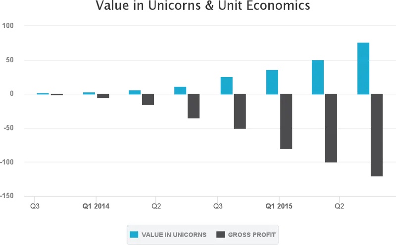
The chart below directly came from Visible! Feel free to use in any of your pitch decks.
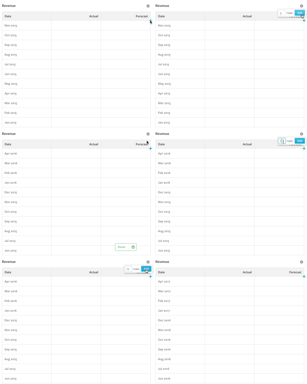
Now we are grooving. Unicorn status isn’t in vogue like it used to be; however, hitting your forecasts will always be cool ;). Feel free to add as many data points into the future as you’d like! Click the “+” icon in any metric and you’ll start to see what 2020 looks like. And if you need help getting started with financial modeling, we’ve got you covered right here!
You can now export all of the data of your company. We are rolling this out in “beta” so shoot us an email and we will tell you how to access this easter egg.
We hope you enjoyed this update and as always please feel free to send us any feedback or questions our way!
#tellyourstory
-Mike and The Visible Team
