Tailoring Your Fundraising Efforts

Matt Preuss
Marketing Manager
Default Properties Popular Custom Properties Reading List
Unlock your investor relationships. Try Visible for free for 14 days.
Start your free trial

Last week we covered how many investors founders need in their fundraising pipeline. When communicating with 50+ investors during a fundraise, founders need a system to track and manage their ongoing investor conversations.

Default Properties

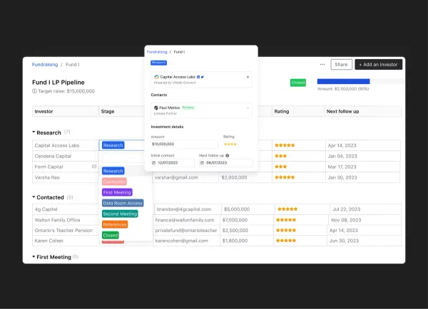
At Visible, we help founders do just this with our Fundraising CRM. Like any CRM, we offer default properties for investor contacts (e.g. potential investment amount, star rating, contact date, follow up date, etc).

Popular Custom Properties

In addition to the default properties, founders are using custom properties to match their fundraising efforts — check out the most common custom properties below to see how other founders are keeping tabs on their pipeline:

  • Min & Max Check Size — In addition to our default check size property, we are seeing founders track min and max check size amount to get a more accurate look at where their round stands.
  • Connection — Warm introductions are valuable when fundraising. Founders are tracking who made/can make an introduction.
  • Data Room Shared — If a founder is moving an investor down their fundraising funnel, chances are a data room will be shared. In order to keep track of who has access, founders are creating a yes/no property to track who has access.
  • Investor Type — We are seeing founders track the type of investor to have a better look at the mix of investors in their pipeline — e.g. strategic, existing, lead, etc.
  • Will They Lead — Finding a lead investor is a must for a fundraise. Keeping an eye on lead investors is a surefire way to help founders stay focused on the right investors.

Of course, these are just a few of the custom properties founders are using — we’ve even seen a few founders track an investor’s favorite sports team or personal interests. Learn more about our Fundraising CRM and give it a try below:

Learn More

Reading List

Level up Your Fundraising Process with Email Syncing

In order to best help founders stay on top of their raise, we recently launched a BCC tool to help founders sync emails from outside Visible to the respective investor record in Visible. Read more

A Guide to Seed Fundraising

The team at Y Combinator shares an in-depth guide covering the ins and outs of raising a seed round. Read more

Seamlessly Manage Relationships with an Investor CRM

On the Visible blog, we break down what founders should look for in an investor CRM and fundraising tracking tool. Read more

You may also enjoy:
Product Updates
Shaping the Future: Unveiling Our Brand Refresh
Visible started as a way for founders to update their investors but has since transformed into a purpose-built platform for both founders and investors. Since 2014, we’ve powered over 3M interactions between founders and investors. Our brand refresh represents our commitment to equip founders and the investors who back them. Founders can now manage their investor relationships and capital raises from start to finish. Investors can centralize data, uncover insights, and report to their LPs and stakeholders—all from one place. We are excited to unveil our refreshed brand, marking the beginning of the next decade in our dedication and commitment to founders and investors. Equipping Founders and Investors for Growth Raising capital is fundamentally about building relationships. Founders and investors spend months forging connections that, once solidified by a term sheet, can evolve into partnerships lasting 8 to 10 years and beyond. We set out to highlight the people behind the investments, not just the companies or firms they represent. As we continue to grow, you'll notice more familiar faces from different startups and venture funds featured on our site (👋 Hi Lacey!). Shaping Our Future Across our website and marketing assets, you’ll see 3D shapes floating in the background. While they add aesthetic appeal, they also carry a deeper meaning. For example: We believe raising capital from VCs or LPs closely resembles a fundraising funnel, a concept brought to life through the funnel shape that appears across various pages and assets. Sphere, torus, and pill shapes symbolize the connections between VCs, founders, and stakeholders, reflecting the interwoven nature of these relationships. These forms also symbolize forward momentum and the continuous progression within the venture ecosystem. As our product has evolved to offer greater flexibility in moving data into and out of Visible, you'll notice pipes integrated into the design, visually representing the seamless flow of data through our platform. Logo and Wordmark To maintain and perpetuate our brand equity, we opted to anchor our brand to our current logo and wordmark. The Visible logomark is made from three overlapping, equilateral triangles. Each triangle is slightly transparent, allowing the mark to interact with other design elements. These triangles represent human relationships and the connection between founders and investors, which is core to our mission and vision for our company. Color Palette Our signature black primary color remains, but we've refined our palette for a fresh look. We've transitioned from a complex, rich color scheme to a more cohesive and defined palette, creating a unified and bold approach to color across our brand. Introducing the new Visible color palette: Product Guided by our core values of trust and transparency, we designed our product to embody these principles. Our product visuals across the site are predominantly high-fidelity for the first time, highlighting its capabilities visually rather than relying solely on words. The updated typography and refined color palette are seamlessly integrated into our product screens, further enhancing the overall brand experience. Voice & Tone A brand is more than just its visual identity; it requires a voice and tone that harmonizes with its design. We aimed for our voice to be authentic, credible, and consistent, supporting both investors and founders alike. This commitment led us to define key principles for our voice and tone: Be a guide Less is more Recognize that different users face different challenges As you explore our marketing site, we hope Visible reflects these values and resonates with you. Transparency = Trust As we noted earlier, raising capital is fundamentally about relationships. Trust and transparency form the foundation of any strong connection. Throughout our website, you'll notice subtle transparency elements that embody this core principle. This new iteration of our brand is built to scale, but that doesn’t mean we won’t continue to evolve and elevate the experience for the betterment of our prospects and customers. Here's to shaping the next 10 years! Up and to the right,  The Visible Team
Product Updates
Product Update: Turn Emails Into Insights With Visible AI Inbox
Customer Stories
Case Study: Airtree Venture's Transformation with Visible
Fundraising
9 Tips for Effective Investor Networking