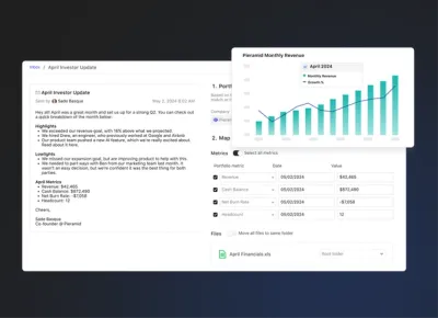
Over the past twelve months, Visible has evolved from a tool to help founders write great investor updates to a platform to help founders Raise capital, Track key metrics, and Update investors.
We felt it was only fitting to evolve our brand just as we have evolved our product. We’re excited to share our new brand identity with you that pays homage to our past while letting us grow into our future.
Our mission hasn’t changed, we are still here to give founders a better chance of success.
We’ve updated our logo, wordmark, typeface, colors, and imagery across our marketing assets and app. Below we’ll get into why we ultimately made the change and how we went about accomplishing the overhaul this summer.
Why change?
Simply put, we love founders. We really started to feel this over the past two years after getting to work with over 4,300 founders across the globe. In our new brand identity, you’ll see that founders will be at the forefront of everything we do.
Why do we love founders? Because the odds are perpetually stacked against them but they always find a way to keep going. Being a founder is the toughest and oftentimes the loneliest job there is. Founders are forging new paths with future obstacles they can’t see paired with an environment that is ever-evolving.
So how does a founder navigate all of this? Withtrusted guides. Maybe that guide is a founder who has forged their own path or an investor who has seen others succeed (or fail) through similar obstacles. The guide could also be a significant other, an independent board member, or a close mentor.
One thing became clear to us, scaling a startup is a people and relationship driven endeavor. We hope thatVisible can act as a trusted guide and resource to founders. We also want Visible to act as a catalyst to help founders build relationships with other trusted guides to help take them on their journey. This is why we are updating our brand, to reflect our drive to serve founders first and the guides who support them.
Here are some of the tools & resources we’ve recently launched for founders to help them on their journey:
- Visible Connect – A free investor database so founders can quickly find which potential investors they should be building relationships with.
- 176 editions of theFounders Forward – Our curated weekly newsletter that has gone out rain or shine every Thursday.
- Visible for Investors – The most founder friendly tool an investor can use to engage with their portfolio.
- We wrote 3,800 words in ourall encompassing startup fundraising guide to help founders who are fundraising for the first time.
- The Visible Founder Community – This is currently in alpha with some of our customers. We just made a hire to take this to the next level. Stay tuned!
If you like getting into the details of how we went about deciding on the new brand and what it entails. Keep reading!
The Process
After we decided that we wanted to update our brand identity we dug into our design values & process, looked at the competitive landscape, talked to our customers, and even reviewed conversion data of our marketing funnel. To give an inside peek at some of our research and process:
Design Values
- Empowerment – We want to make complex tasks simple, while also providing customers with all the valuable information they can get to improve their investor relationships.
- Reliability – We want customers to trust Visible. They should not only trust that every investor update email is going to be sent but that our team is here when you need us.
- Consistency – We need to be consistent in our communication and in our user experience. When we launch something new customers should feel like they know it by heart.
Competitors
We took a look at our customers and their brand identities. We wanted to make sure we could differentiate and stand out. We saw a lot of blue.
Mood Board
After we pulled all of our research together, we got started on a mood board. We knew that if we wanted to be a trusted guide for founders we need to convey trust, fearlessness, and experience. Here are some early mood boards:
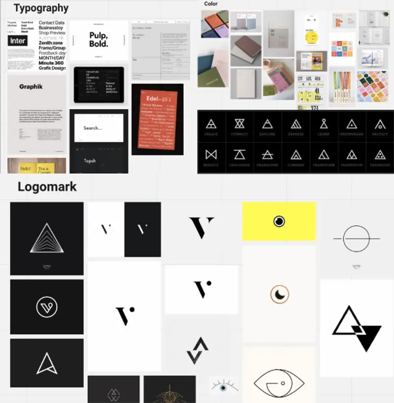
Two ideas started to emerge that we liked:
- The editorial feel our marketing site could have. Our articles and resources were read by more than 175k people in 2020. Let’s elevate the content with a more editorial and educational look.
- Triangles vibed well with where we wanted to go. The glyphs above have a lot of parallel meanings to building a startup, it plays nicely with the V in Visible and also has elements of climbing a mountain.
Of course, we reviewed many iterations of our logo, typeface, and marketing site before landing on the final product.
The Logo
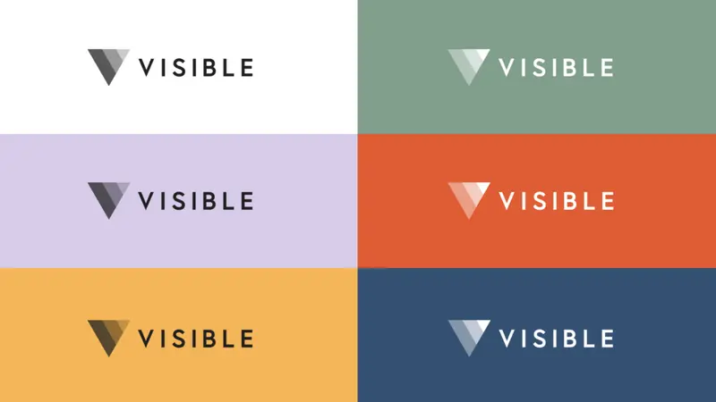
It is made of 3 overlapping, equilateral triangles. Each triangle is slightly transparent, allowing the mark to interact with other design elements.
The triangles represent human relationships, both the connection between each of us and the ever-shifting overlap across myriad networks. There’s also a resonance with the strength of triadic relationships in management and the value created between customers, founders, and VCs, as well as founders, VCs, and LPs.
The logomark also pays a nice tribute to our current logo which has an overlapping pie chart. The logo also makes your eyes go “up and to the right”, a common salutation for our content and represents the never ending journey for growth.
Typography
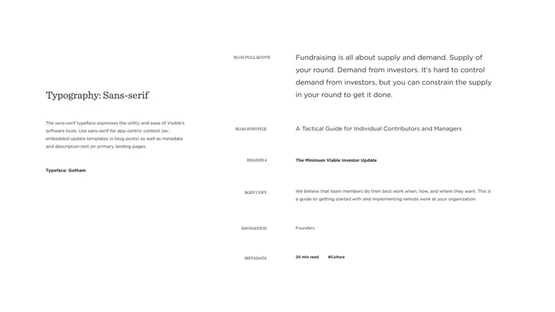
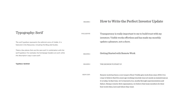
We found the need to have both serif and sans-serif typefaces in our updated brand style guide. With software interfaces at the core of our products, we found that sans-serif fonts offer the right combination of efficiency and legibility at all sizes.
We’re also introducing a beautiful new serif typeface that helps us express the quality and trustworthiness of the content we create and curate for founders. The serifs look great for headers and big and bold for things like inspiring quotes.
Imagery
We really wanted to bring our customers, founders, community – people! – to the forefront of our brand. Illustrations are trendy but can feel very abstract and lack relatable humanness. We found beauty and inspiration in seeing a diverse group of people doing incredible work.
We enjoy the stark contrast of a black and white photo but also how it plays nicely with vibrant headshots. Our logomark really pops across different media types from photos to videos.


Founders Forward –> The Visible Weekly
The Founders Forward is now The Visible Weekly and will also get a bit of a facelift. We decided it was better to support fewer brands and sunsetted the yellow branding and logo. If we want to better serve founders we felt that Visible should be the core focal point across all of our content.
Don’t worry… the newsletter isn’t going anywhere! It will still be curated by our team and produced once a week. If you haven’t subscribed you can do so here -> visible.vc/subscribe
Our App
In the immediate, our app will have the new logo, color palette, and showcase some of the new brand elements. Over time we’ll introduce more changes that further blend our brand identity into the product.
Thanks
Most importantly we’d like to thank you, our community, for your encouragement, feedback, and support to get us to this point. We are energized for the years to come and can’t wait to give you a better chance of success.
I personally want to thank the entire Visible team for their drive to better serve founders and our customers. The new brand was a total team effort and none of this would be possible without a team who isn’t scared to do the difficult.
Up & to the right,
Mike Preuss
Visible CEO & Co-founder
