Today’s feature announcement is relatively minor (yet awesome) but its meaning is much greater. If you just want to read about Shareable Dashboards head to the bottom. If you want to hear what we are up to, keep reading. I’m really excited to share Visible’s focused vision for our product and business.
When we on-boarded our first customer almost three years ago (thanks Iron Yard!) our goal was to solve the pain that came with monitoring and managing a privately held portfolio. We constantly heard the same thing from investors over and over again,
“I never get investor updates or know what is going on with my portfolio!”
We set out with a grand vision to build a product used by companies to provide KPIs, updates and cap tables to their investors in addition to a product that would roll all of this information up to the investors and for their own reporting to their investors (LPs).
We learned two valuable lessons from this initial product and go-to-market strategy:
- Companies have to want to communicate with their stakeholders and respect their relationship with them. (Btw – we’ve also found that the best ones do and are 200% more likely to get funded)
- We were trying to solve too many problems for too many people. We built very average features for all of the end-users which were not 10x better than current workflows in the market.
Despite the issues above we were able to prove that there is a big problem in the space and that we could execute. We raised some funding and started to build a world-class team. We went to the drawing board and launched Visible 2.0 last summer (if you want to check out the technical considerations read Karel’s post).
With Visible 2.0 launched and in market we saw many interesting use cases develop (including but not limited to):
- A distillery in NYC sharing depletion and market data with their sales team.
- A team at a 900 person travel company providing Updates internally
- Marketing and branding agencies sharing campaign and other KPIs with their clients
- Innovative CFO & Accounting firms like Xcelerate Financial, Scalability, and LiveCA integrating their clients into the Visible ecosystem.
- A church in New Zealand providing updates to the congregation.
- And of course our original use case where Unbounce is providing monthly investor updates about their $12,000,000 a year business!
With our learnings and and evolving use cases we started to greatly hone in our product focus and strategy. We removed the cap table, improved our Updates editor, invested in creating great content like our ebook on data distribution and model for total addressable market. Our goal was (and is) to create a frictionless product while helping educate the market.
So what does this all mean? In short, we want to empower companies to share the story of their data with their stakeholders. It doesn’t mean that we are getting out of the investor reporting or portfolio game…quite the opposite. We are doubling down but also building a platform to elegantly handle all the uses cases mentioned above.
What about the product? Starting with this launch we are merging the idea of “companies” and “funds” in our product architecture. Our current customers and users wont know the difference; however, it opens up to handle more use cases & complexities for the future. The first step in this endeavor is sharing dashboards:
Sharing Dashboards
Starting today you’ll be able to share specific dashboards with individuals directly or with one of your Contact Lists. We’ve received a lot of feedback that companies want to only share certain dashboards with certain team members, investors or clients giving them more control over who can see what.
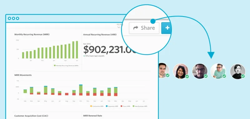
Those with access to shared dashboards will have a feed at the user level of all of the dashboards they have access to along side Updates they have received.
So what is next? Over the coming weeks and months you can expect the following from the Visible team:
- Improved data integrations – If you are using our Quickbooks, Xero or Google Analytics integrations give me a shout.
- More advanced charting, Updates and ways to present data outside of Visible.
- The ability for an individual assign Dashboards or Updates to an entity. E.g. if you are a VP of Sales and getting an Update from a sales manager, you can assign it to your sales entity in Visible or if you are a GP of a VC fund and get a dashboard from a company, you can assign it to the proper fund in Visible.
- “Data Pipes”. That is what we are calling them internally for now. Sometimes you need to get raw data from one entity to another for analysis. We will be enabling (on a per metric level) to share a metric with an individual or list similar to Dashboards.
I’m truly excited for what is ahead and to share the journey with our customers and community.
Up & to the right,
-Mike
