Quick Ratio Formula

Matt Preuss
Marketing Manager
Quick Ratio Formula in Visible
Unlock your investor relationships. Try Visible for free for 14 days.
Start your free trial

The SaaS Quick Ratio is a simple formula used to measure the efficiency of your SaaS company’s growth. A quick ratio gives a company a reliable source to predict how they can grow revenue with churn in mind. In short, the quick ratio formula is new MRR by lost MRR over a period of time. The higher your quick ratio the stronger the growth. The quick ratio formula can be found below:

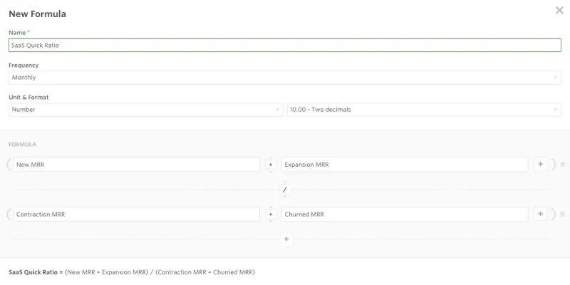
Quick Ratio Formula = (New MRR + Expansion MRR) / (Contraction MRR + Churned MRR)

A low churn rate is often the most efficient way to grow your SaaS business. While new MRR is vital to a company’s success as well, a high churn rate will make it virtually impossible to have a sustainable growth rate. As Tomasz Tunguz puts it, “If the churn number is unsustainably high, we know from previous churn analyses that high churn implies lower growth rates and dramatically less efficient growth.”

While a high MRR growth rate can mask a high churn rate, the best-in-class companies always have a low growth rate, creating a much higher quick ratio.

Quick Ratio Formula in Visible

Creating a quick ratio formula in Visible is incredibly easy with our formula builder. First, you’ll want to make sure you have your recurring revenue metrics in Visible. We would suggest using user provided metrics or using Google Sheets, Salesforce, HubSpot or ChartMogul to automatically get your recurring revenue metrics in Visible.

Once your metrics are in Visible, you’ll want to start building your quick ratio formula. To start, add any new and expansion MRR metrics in the top line. For our quick ratio formula we only mention MRR and Expansion MRR but this could include reactivated, multiple product, etc. On the bottom row, you’ll want to add any “loss” MRR metrics, like contraction and churned MRR.
After the quick ratio formula is setup, it will automatically be calculated as any new data comes in from your integrations. Next, you’ll want to visualize, distribute, and act on your quick ratio. We suggest sharing your quick ratio with managers and executives on your team so everyone has an easy way to understand the growth of your company at a quick glance. Generally, we do not see companies share their quick ratio with their investors as if you have a down month or period it may display poorly and generate unnecessary concerns.

Tracking your quick ratio is a great way for SaaS companies to get a quick idea of how efficiently they are growing. The easiest way to strengthen your SaaS quick ratio is by shrinking your monthly churn rate. Learn more about your quick ratio here.

You may also enjoy:
Product Updates
Shaping the Future: Unveiling Our Brand Refresh
Visible started as a way for founders to update their investors but has since transformed into a purpose-built platform for both founders and investors. Since 2014, we’ve powered over 3M interactions between founders and investors. Our brand refresh represents our commitment to equip founders and the investors who back them. Founders can now manage their investor relationships and capital raises from start to finish. Investors can centralize data, uncover insights, and report to their LPs and stakeholders—all from one place. We are excited to unveil our refreshed brand, marking the beginning of the next decade in our dedication and commitment to founders and investors. Equipping Founders and Investors for Growth Raising capital is fundamentally about building relationships. Founders and investors spend months forging connections that, once solidified by a term sheet, can evolve into partnerships lasting 8 to 10 years and beyond. We set out to highlight the people behind the investments, not just the companies or firms they represent. As we continue to grow, you'll notice more familiar faces from different startups and venture funds featured on our site (👋 Hi Lacey!). Shaping Our Future Across our website and marketing assets, you’ll see 3D shapes floating in the background. While they add aesthetic appeal, they also carry a deeper meaning. For example: We believe raising capital from VCs or LPs closely resembles a fundraising funnel, a concept brought to life through the funnel shape that appears across various pages and assets. Sphere, torus, and pill shapes symbolize the connections between VCs, founders, and stakeholders, reflecting the interwoven nature of these relationships. These forms also symbolize forward momentum and the continuous progression within the venture ecosystem. As our product has evolved to offer greater flexibility in moving data into and out of Visible, you'll notice pipes integrated into the design, visually representing the seamless flow of data through our platform. Logo and Wordmark To maintain and perpetuate our brand equity, we opted to anchor our brand to our current logo and wordmark. The Visible logomark is made from three overlapping, equilateral triangles. Each triangle is slightly transparent, allowing the mark to interact with other design elements. These triangles represent human relationships and the connection between founders and investors, which is core to our mission and vision for our company. Color Palette Our signature black primary color remains, but we've refined our palette for a fresh look. We've transitioned from a complex, rich color scheme to a more cohesive and defined palette, creating a unified and bold approach to color across our brand. Introducing the new Visible color palette: Product Guided by our core values of trust and transparency, we designed our product to embody these principles. Our product visuals across the site are predominantly high-fidelity for the first time, highlighting its capabilities visually rather than relying solely on words. The updated typography and refined color palette are seamlessly integrated into our product screens, further enhancing the overall brand experience. Voice & Tone A brand is more than just its visual identity; it requires a voice and tone that harmonizes with its design. We aimed for our voice to be authentic, credible, and consistent, supporting both investors and founders alike. This commitment led us to define key principles for our voice and tone: Be a guide Less is more Recognize that different users face different challenges As you explore our marketing site, we hope Visible reflects these values and resonates with you. Transparency = Trust As we noted earlier, raising capital is fundamentally about relationships. Trust and transparency form the foundation of any strong connection. Throughout our website, you'll notice subtle transparency elements that embody this core principle. This new iteration of our brand is built to scale, but that doesn’t mean we won’t continue to evolve and elevate the experience for the betterment of our prospects and customers. Here's to shaping the next 10 years! Up and to the right,  The Visible Team
Product Updates
Product Update: Turn Emails Into Insights With Visible AI Inbox
Customer Stories
Case Study: Airtree Venture's Transformation with Visible
Fundraising
9 Tips for Effective Investor Networking