Product Update: Seamless Dashboard Management

Belle Raab

Visualizing and analyzing portfolio data is an important part of taking portfolio monitoring seriously at any venture firm.

Visible makes this easy with four different dashboard types:

  • Flexible dashboards
  • Portfolio metric dashboards
  • Fund performance dashboards
  • Tear sheets (which have the same functionality as flexible dashboards but are restricted to a one-page format)

Related resource: Unlocking Venture Capital Portfolio Insights with Dashboards

In these latest product updates, Visible makes it easier for VCs to maintain data visualization accuracy and ensure that the qualitative information about portfolio companies is as up-to-date as possible on flexible dashboards.

The main reason VCs create flexible dashboards on Visible is to support their internal portfolio review meetings. These meetings help VC firms align on the progress updates across the portfolio and make strategic decisions related to portfolio support and follow-on investments.

Keep reading to understand how recent product updates make it even easier to manage and update data visualizations on Visible's flexible dashboards.

Recent Dashboard Management Product Updates

Setting date ranges at the dashboard level
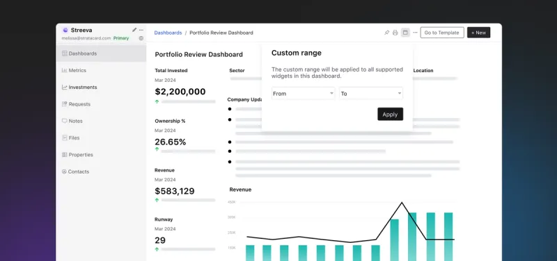
With this product update, investors can filter entire dashboards by a custom date range in addition to setting specific date ranges at the widget level. This streamlines the dashboard creation and maintenance process.

Automatically updated company highlights and lowlights
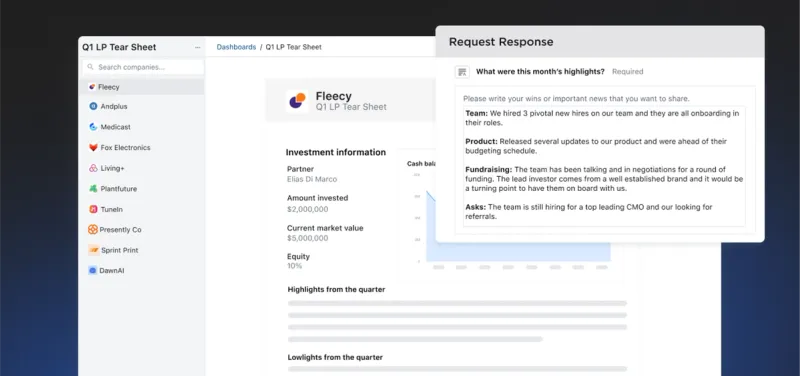
Investors can now request properties in Visible Requests and when companies submit their responses to qualitative questions, the property widgets are automatically updated on dashboards. This saves investors several steps in the process of making qualitative updates from their companies accessible to their wider team.

Editing properties inline on dashboards
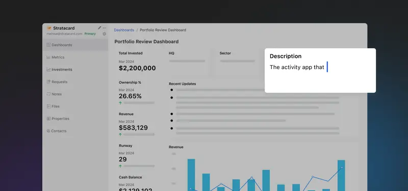
This update lets investors quickly edit the property values displayed on portfolio company dashboards. Examples of properties commonly updated include:

  • "Recent updates"
  • "Company description"
  • "Notes"
  • "Last discussed"

Giving users the ability to edit properties directly on a dashboard means investors don't have to navigate back and forth between the dashboards and properties section to make changes to their dashboards.

You may also enjoy:
Product Updates
Shaping the Future: Unveiling Our Brand Refresh
Visible started as a way for founders to update their investors but has since transformed into a purpose-built platform for both founders and investors. Since 2014, we’ve powered over 3M interactions between founders and investors. Our brand refresh represents our commitment to equip founders and the investors who back them. Founders can now manage their investor relationships and capital raises from start to finish. Investors can centralize data, uncover insights, and report to their LPs and stakeholders—all from one place. We are excited to unveil our refreshed brand, marking the beginning of the next decade in our dedication and commitment to founders and investors. Equipping Founders and Investors for Growth Raising capital is fundamentally about building relationships. Founders and investors spend months forging connections that, once solidified by a term sheet, can evolve into partnerships lasting 8 to 10 years and beyond. We set out to highlight the people behind the investments, not just the companies or firms they represent. As we continue to grow, you'll notice more familiar faces from different startups and venture funds featured on our site (👋 Hi Lacey!). Shaping Our Future Across our website and marketing assets, you’ll see 3D shapes floating in the background. While they add aesthetic appeal, they also carry a deeper meaning. For example: We believe raising capital from VCs or LPs closely resembles a fundraising funnel, a concept brought to life through the funnel shape that appears across various pages and assets. Sphere, torus, and pill shapes symbolize the connections between VCs, founders, and stakeholders, reflecting the interwoven nature of these relationships. These forms also symbolize forward momentum and the continuous progression within the venture ecosystem. As our product has evolved to offer greater flexibility in moving data into and out of Visible, you'll notice pipes integrated into the design, visually representing the seamless flow of data through our platform. Logo and Wordmark To maintain and perpetuate our brand equity, we opted to anchor our brand to our current logo and wordmark. The Visible logomark is made from three overlapping, equilateral triangles. Each triangle is slightly transparent, allowing the mark to interact with other design elements. These triangles represent human relationships and the connection between founders and investors, which is core to our mission and vision for our company. Color Palette Our signature black primary color remains, but we've refined our palette for a fresh look. We've transitioned from a complex, rich color scheme to a more cohesive and defined palette, creating a unified and bold approach to color across our brand. Introducing the new Visible color palette: Product Guided by our core values of trust and transparency, we designed our product to embody these principles. Our product visuals across the site are predominantly high-fidelity for the first time, highlighting its capabilities visually rather than relying solely on words. The updated typography and refined color palette are seamlessly integrated into our product screens, further enhancing the overall brand experience. Voice & Tone A brand is more than just its visual identity; it requires a voice and tone that harmonizes with its design. We aimed for our voice to be authentic, credible, and consistent, supporting both investors and founders alike. This commitment led us to define key principles for our voice and tone: Be a guide Less is more Recognize that different users face different challenges As you explore our marketing site, we hope Visible reflects these values and resonates with you. Transparency = Trust As we noted earlier, raising capital is fundamentally about relationships. Trust and transparency form the foundation of any strong connection. Throughout our website, you'll notice subtle transparency elements that embody this core principle. This new iteration of our brand is built to scale, but that doesn’t mean we won’t continue to evolve and elevate the experience for the betterment of our prospects and customers. Here's to shaping the next 10 years! Up and to the right,  The Visible Team
Product Updates
Product Update: Turn Emails Into Insights With Visible AI Inbox
Customer Stories
Case Study: Airtree Venture's Transformation with Visible
Fundraising
9 Tips for Effective Investor Networking