At its core, a successful fundraise comes down to storytelling. Founders need to tell a narrative to investors that piques their interest and ultimately leads to a check down the road. As Kristian Andersen of High Alpha puts it,
“I always encourage founders to start with a story and think about it very fundamentally. Think about it very fundamentally. What is the plot? You have a protagonist, you have an antagonist, you have a climax. That storytelling structure can and should be applied to a pitch.”
Outside of a verbal pitch, there are countless tools you can use to help tell your story. One of the most popular (and important) tools is a pitch deck. A pitch deck can be a powerful visual tool to help fuel your storytelling and increase your odds of a successful raise.
In this guide, we’ll dive into what makes for a well-designed pitch deck. We cover everything from visualizing data to choosing fonts and layouts.
What Makes a Good Pitch Deck Design
A pitch deck is a tool that is used to visualize and assist with your story as you “pitch” a group. For this instance, we’ll be talking about pitch decks and how they apply to a venture fundraise. A pitch deck is a small but important part of a successful pitch and fundraise.
Some investors won’t necessarily require a pitch deck, they are widely accepted (and expected). Some investors, like Gale Wilkinson of Vitalize, are fine with an investment memo, Notion document, or a pitch deck.
If you do decide that building a pitch deck is right for your business, there are a few points to consider:
- Do you need a pitch deck?
- Why should someone care about your pitch?
- How long do you want it to be?
- How much context should you give investors before sharing it with them?
- How should you balance design vs. content?
To learn more about building a pitch deck, check out this post from the team at High Alpha.
At the end of the day, pitching your company (and building a pitch deck) is an opportunity to talk about your company and your vision — fundraising is incredibly difficult and time-consuming but it can and should be exciting! Lindsay Tjepkema, CEO of Casted, summed it perfectly when she said:
“There’s nothing better than being able to talk to person after person about your company. That’s a great feeling and it’s exhilarating and it’s exciting to be able to share your passion with someone else. That’s also the hardest part because it’s your baby. And when you share something with so many people and you get so many nos, that’s hard.”
Bottling up that passion for your company and vision can be a great backbone when going into creating your pitch deck. You are putting your company on display and want to make sure it is something you are personally confident and proud of.
Related Reading: 18 Pitch Deck Examples for Any Startup
Pitch Deck Designing Best Practices
Different investors will tell you different things when it comes to pitch deck design. Some will say it needs to be polished and perfect. Others will say too well-designed is a signal a founder is spending too much time on it (and not enough on the business).
What you present and share with investors is ultimately up to you but there are a few key focus areas if you’re not sure where to get started with your design:
Keep it Simple
Keeping your pitch deck simple is incredibly important. Investors are likely looking through hundreds or thousands of decks in a given year so keeping it simple and digestible is important. A few tips to keep things simple:
- Has a natural flow
- Legible fonts
- Simple branding
- Easy-to-understand data visualizations and images
- Media files are digestible
Be Awesome at Storytelling
As we mentioned at the beginning of this post, a pitch deck is ultimately a tool to help you tell your story. You can quite literally think through your pitch deck as you would a story. What is the plot? Who is your audience? Who is the antagonist? Who is the protagonist?
Use Data in Form of Charts and Graphs
As we mentioned earlier, oftentimes simple is better. Charts, graphs, and data visualizations are your friend. They can be leveraged to easily and creatively display key data about your business. However, data without context can be dangerous. Investors are potentially looking through your data without you so make sure it is incredibly clear and can be understood if you’re not in the room with them.
Whenever Possible Use Icons or images
Different icons and images can be useful when trying to convey different messages and points throughout your pitch deck as well. Instead of writing a story of how a customer is leveraging your product, consider using images of them and telling the story yourself.
If you do decide to include images make sure they are high quality. This is true for company headshots and any supporting images throughout your pitch.
Make Your Objective Crystal Clear
If you’re keeping your pitch deck simple you should only be including things that are necessary to your story and pitch. Each slide should be well thought out and have an obvious point or call to action that you are trying to get across. No matter what the content is on a given slide (image, written, video, etc.) the point and intent should be obvious.
Consider Using Different Types of Layouts
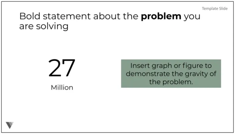
You can keep your pitch deck simple but engaging at the same time. Different layouts are a great way to put emphasis on different points and sections of your story and pitch. For example, if you want to highlight a big problem or metric that is exciting, you can use a big splash like the example below:

Or if you want to demonstrate how you’ll be putting capital to use, you can use a timeline like the example below:

Use a Chart to Display Milestones
While a story is a driving force behind a pitch, investors will want to dig into different data points and metrics from your success thus far. Be sure to include charts that show traction or growth. These can be great areas to excite and motivate your investors to move through the fundraise quickly.
Consider a Professional Pitch Deck Designer
Of course, being a founder is incredibly busy. You are building your business, hiring, closing customers, and more so designing your pitch deck might sit on the backburner. In order to help you build a great pitch deck, there are countless agencies and tools out there to help you. Freelancers are a great option or the team at 4th & King has helped founders raise $5B+ with their help.
Related Resource: Our Startup Pitch Deck Template
Pitch Deck Designs Brought to you by Visible
Fundraising and pitching your company is incredibly difficult. No matter where you land on the importance of a well-designed pitch deck, just remember it is an opportunity for you to talk about your company and passion to hundreds of investors. If you’d like to learn more about building your pitch deck, check out our in-depth guide, “Tips for Creating an Investor Pitch Deck.”
Visible is here to help with your next fundraise. Find investors, share your pitch deck, and track your raise all from one place. Try it for free for 14 days here.


