Our New Contextual Help Guide

Mike Preuss
CEO
Improving Our SaaS Onboarding
Unlock your investor relationships. Try Visible for free for 14 days.
Start your free trial

Every six months I usually say something along these lines to our awesome product team…

“I just went through our on-boarding flow, I think we could be doing a better job. How do we let customers help themselves but also not leave them with a completely blank slate? Can’t we make signing up more frictionless? What if they never know XYZ exists?”

Improving Our SaaS Onboarding

Our team goes to work, we make some great improvements and then six months later I go through our sign up flow again. Rinse & Repeat. This time around, our team spent days researching what the best companies are doing. We read their blog posts and looked at how they tackled the problem. Then a funny patterned emerged. Whenever we tried out their latest sign up and on-boarding flow, in almost every instance, it was totally different to their most recent blog post about how they improved it! We realized we weren’t alone.

When we started to ideate on our new on-boarding flow we created a list of things that we didn’t want. In particular:

  • We didn’t want an on-boarding experience that a user just clicked rapidly through to get to start using the app.
  • We didn’t want to have to draw cute arrows for the user to find out where things were.
  • We didn’t want to have a bunch of fake & dummy data populate their instance only for them to have to delete it.

Our goal was simple: Provide help when the customer needs it and get out of the way. Today we’re excited to launch our new Help Guide available to current customers and new triallers.

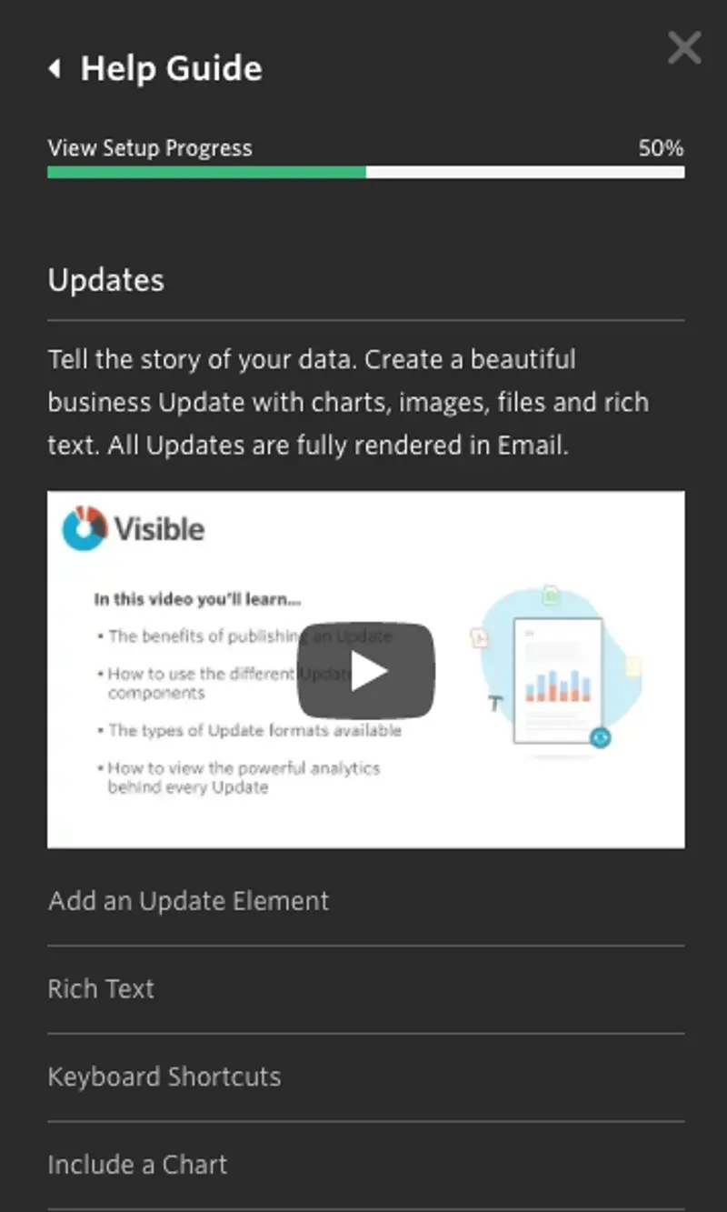
To enable our new on-boarding and help guide just click “Help Guide” in the bottom left of your navigation on Visible. From the right our guide will slide out and give you tips, tricks, GIFs and videos.

The best part? It is contextual. Depending on where you are in the app we will will show you relevant videos, GIF and links to our knowledge base to make sure you are getting the most from Visible. For example, if you are in Updates and open the help guide we will show you a quick 2-3 minutes video, give you an overview of the section and a list of related features you can take advantage of with GIFs and links to our knowledge base.
I’m hoping that if you are reading this blog post in six months and sign up for Visible, our on-boarding and Help Guide are still here for you! If you have any questions, comments or suggestions email hi@visible.vc.

Up & to the right,

-Mike

You may also enjoy:
Product Updates
Shaping the Future: Unveiling Our Brand Refresh
Visible started as a way for founders to update their investors but has since transformed into a purpose-built platform for both founders and investors. Since 2014, we’ve powered over 3M interactions between founders and investors. Our brand refresh represents our commitment to equip founders and the investors who back them. Founders can now manage their investor relationships and capital raises from start to finish. Investors can centralize data, uncover insights, and report to their LPs and stakeholders—all from one place. We are excited to unveil our refreshed brand, marking the beginning of the next decade in our dedication and commitment to founders and investors. Equipping Founders and Investors for Growth Raising capital is fundamentally about building relationships. Founders and investors spend months forging connections that, once solidified by a term sheet, can evolve into partnerships lasting 8 to 10 years and beyond. We set out to highlight the people behind the investments, not just the companies or firms they represent. As we continue to grow, you'll notice more familiar faces from different startups and venture funds featured on our site (👋 Hi Lacey!). Shaping Our Future Across our website and marketing assets, you’ll see 3D shapes floating in the background. While they add aesthetic appeal, they also carry a deeper meaning. For example: We believe raising capital from VCs or LPs closely resembles a fundraising funnel, a concept brought to life through the funnel shape that appears across various pages and assets. Sphere, torus, and pill shapes symbolize the connections between VCs, founders, and stakeholders, reflecting the interwoven nature of these relationships. These forms also symbolize forward momentum and the continuous progression within the venture ecosystem. As our product has evolved to offer greater flexibility in moving data into and out of Visible, you'll notice pipes integrated into the design, visually representing the seamless flow of data through our platform. Logo and Wordmark To maintain and perpetuate our brand equity, we opted to anchor our brand to our current logo and wordmark. The Visible logomark is made from three overlapping, equilateral triangles. Each triangle is slightly transparent, allowing the mark to interact with other design elements. These triangles represent human relationships and the connection between founders and investors, which is core to our mission and vision for our company. Color Palette Our signature black primary color remains, but we've refined our palette for a fresh look. We've transitioned from a complex, rich color scheme to a more cohesive and defined palette, creating a unified and bold approach to color across our brand. Introducing the new Visible color palette: Product Guided by our core values of trust and transparency, we designed our product to embody these principles. Our product visuals across the site are predominantly high-fidelity for the first time, highlighting its capabilities visually rather than relying solely on words. The updated typography and refined color palette are seamlessly integrated into our product screens, further enhancing the overall brand experience. Voice & Tone A brand is more than just its visual identity; it requires a voice and tone that harmonizes with its design. We aimed for our voice to be authentic, credible, and consistent, supporting both investors and founders alike. This commitment led us to define key principles for our voice and tone: Be a guide Less is more Recognize that different users face different challenges As you explore our marketing site, we hope Visible reflects these values and resonates with you. Transparency = Trust As we noted earlier, raising capital is fundamentally about relationships. Trust and transparency form the foundation of any strong connection. Throughout our website, you'll notice subtle transparency elements that embody this core principle. This new iteration of our brand is built to scale, but that doesn’t mean we won’t continue to evolve and elevate the experience for the betterment of our prospects and customers. Here's to shaping the next 10 years! Up and to the right,  The Visible Team
Product Updates
Product Update: Turn Emails Into Insights With Visible AI Inbox
Customer Stories
Case Study: Airtree Venture's Transformation with Visible
Fundraising
9 Tips for Effective Investor Networking