How Laurel Hess Sends A Monthly Investor Update in 1 Hour (or Less)

Matt Preuss
Marketing Manager

About Laurel & Hampr

Laurel Hess is the CEO and Founder of hampr. hampr is a peer-to-peer, on-demand laundry app that provides magical wash-and-fold service at the push of a button!

As the hampr website states, “The idea for hampr came after a chaotic weekend with kid sports games and 3 birthday parties. On top of that, there was still grocery shopping, cleaning the house, and oh, spending meaningful time with the family. Laurel was over it. So she thought “Hold on, why can’t laundry be as easy as ordering groceries with a tap of your phone?” And just like that, bam! hampr was born in 2020.”

Quick facts:

  • Founded Year: 2020
  • Headquarters: Lafayette, Louisiana
  • Total Funding Amount: $9.7M
  • Notable Investors: Techstars,VILLAGEx

Learn more about hampr and give it a try yourself here

The Power of Investor Updates for Laurel
Investor updates can be a powerful tool for startup founders. Most VCS only hear from 10-50% of their portfolio companies on a regular basis. This is a major arbitrage opportunity for founders. Investor updates can help you stay top of mind with investors and secure help with fundraising, hiring, closing customers, strategy, etc — all in just an hour or less.

As Laurel Hess wrote in her LinkedIn Post, “It boggles my mind how many founders don't do regular company updates to stakeholders (and potential investors!). So many people I know treat this as a chore - when it can be the highlight of your month (like it is mine!).

Taking the time to review your business with your stakeholders is actually a really great opportunity for growth - if you view it that way, there is a ton of potential to unlock.

I have gained the following from my regular updates:

  • Intros to potential investors
  • Additional capital for a round I'm working on
  • Intros to new verticals for expansion
  • Advice on strategy for a problem we are working on
  • Intros to new mentors/advisors to unlock the next phase of growth

Allllll this for just 1 hour of my time each month? That is the definition of no-brainer."

Laurel’s Investor Update Template

Sticking to a template and format can help build regular investor updates into your monthly rhythms. Laurel shared her monthly template that she uses in Visible via a LinkedIn Post, you can check it out below as well:

“I have used Visible to manage my updates almost since the beginning. I love this company - they make it SO EFFORTLESS to send really factual, data-driven updates.

SO, using Visible, this is how my monthly updates are typically structured:

1. Overview - this is a high-level, personal letter from me about the high notes and low notes of the update. Basically a TL/DR section.

2. Asks - I don't always have these but when I do, I have them right after my summary so it's high on the scroll.

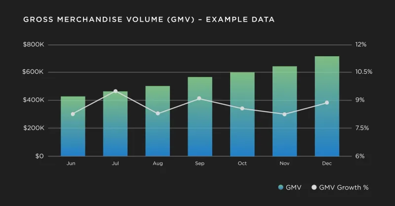
3. Performance - I add charts on GMV growth month-over-month followed by membership KPIs in a chart (growth, churn and renewal). Then I add a summary with my insights/thoughts on each chart. Check out an example of a Visible chart below:
4. What we are excited about: A section on 1 or 2 things that the team is working on that we are really excited about - usually with a photo.

5. What we are Improving/Exploring: This is a realness section of challenges and concerns that we have and what we are doing to actively improve on them.

AND THAT'S IT! It gives a super high-level overview of where we are, what our focus is, and how we are unlocking new opportunities. It's skimmable, it's concise and it's easy for everyone. AND because I use Visible.vc, it automatically ports in the numbers I need for my charts each month so all I have to do is replicate the previous month's email and then go to town. I can get a very thoughtful email out in 1 hour or less - and it gives me so much more in return.”

Check out Laurel's template and add it to your Visible account below:

Send Your Next Investor Update with Visible

Join Laurel and the 3,300+ founders that use Visible to update their investors every month. Try Visible free for 14 days.

Not sure where to get started? Check out our Update Template Library.
You may also enjoy:
Product Updates
Shaping the Future: Unveiling Our Brand Refresh
Visible started as a way for founders to update their investors but has since transformed into a purpose-built platform for both founders and investors. Since 2014, we’ve powered over 3M interactions between founders and investors. Our brand refresh represents our commitment to equip founders and the investors who back them. Founders can now manage their investor relationships and capital raises from start to finish. Investors can centralize data, uncover insights, and report to their LPs and stakeholders—all from one place. We are excited to unveil our refreshed brand, marking the beginning of the next decade in our dedication and commitment to founders and investors. Equipping Founders and Investors for Growth Raising capital is fundamentally about building relationships. Founders and investors spend months forging connections that, once solidified by a term sheet, can evolve into partnerships lasting 8 to 10 years and beyond. We set out to highlight the people behind the investments, not just the companies or firms they represent. As we continue to grow, you'll notice more familiar faces from different startups and venture funds featured on our site (👋 Hi Lacey!). Shaping Our Future Across our website and marketing assets, you’ll see 3D shapes floating in the background. While they add aesthetic appeal, they also carry a deeper meaning. For example: We believe raising capital from VCs or LPs closely resembles a fundraising funnel, a concept brought to life through the funnel shape that appears across various pages and assets. Sphere, torus, and pill shapes symbolize the connections between VCs, founders, and stakeholders, reflecting the interwoven nature of these relationships. These forms also symbolize forward momentum and the continuous progression within the venture ecosystem. As our product has evolved to offer greater flexibility in moving data into and out of Visible, you'll notice pipes integrated into the design, visually representing the seamless flow of data through our platform. Logo and Wordmark To maintain and perpetuate our brand equity, we opted to anchor our brand to our current logo and wordmark. The Visible logomark is made from three overlapping, equilateral triangles. Each triangle is slightly transparent, allowing the mark to interact with other design elements. These triangles represent human relationships and the connection between founders and investors, which is core to our mission and vision for our company. Color Palette Our signature black primary color remains, but we've refined our palette for a fresh look. We've transitioned from a complex, rich color scheme to a more cohesive and defined palette, creating a unified and bold approach to color across our brand. Introducing the new Visible color palette: Product Guided by our core values of trust and transparency, we designed our product to embody these principles. Our product visuals across the site are predominantly high-fidelity for the first time, highlighting its capabilities visually rather than relying solely on words. The updated typography and refined color palette are seamlessly integrated into our product screens, further enhancing the overall brand experience. Voice & Tone A brand is more than just its visual identity; it requires a voice and tone that harmonizes with its design. We aimed for our voice to be authentic, credible, and consistent, supporting both investors and founders alike. This commitment led us to define key principles for our voice and tone: Be a guide Less is more Recognize that different users face different challenges As you explore our marketing site, we hope Visible reflects these values and resonates with you. Transparency = Trust As we noted earlier, raising capital is fundamentally about relationships. Trust and transparency form the foundation of any strong connection. Throughout our website, you'll notice subtle transparency elements that embody this core principle. This new iteration of our brand is built to scale, but that doesn’t mean we won’t continue to evolve and elevate the experience for the betterment of our prospects and customers. Here's to shaping the next 10 years! Up and to the right,  The Visible Team
Product Updates
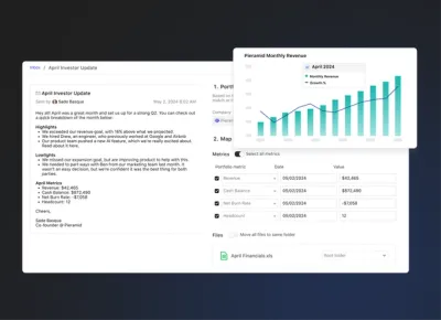
Product Update: Turn Emails Into Insights With Visible AI Inbox
Customer Stories
Case Study: Airtree Venture's Transformation with Visible
Fundraising
9 Tips for Effective Investor Networking