Pitch Deck 101: How Many Slides Should My Pitch Deck Have?

Michael McHugh

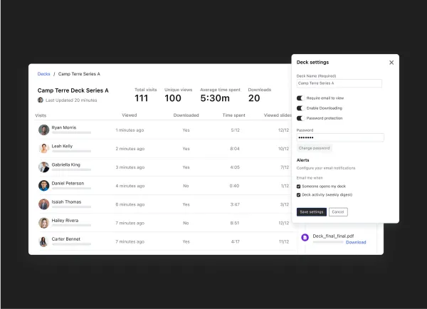
At Visible, we are on a mission to help more founders connect with investors — one of our key tools to help do this is “Decks.” This helps founders share any PDF document with potential investors and colleagues. It enables founders to share documents with security and peace of mind, they know who is viewing their document and the amount of time spent.

We are regularly asked how to construct a pitch deck by startup founders. While there is no silver bullet when it comes to building a pitch deck, we can share the data and best practices we have seen from other founders. We’ve collected thousands of data points related to pitch deck sharing. Learn more about best practices for crafting and sharing your pitch deck below:

The Ideal Startup Pitch Deck Length

The biggest theme we identified is that less is more. The ideal deck size for a stakeholder to view your entire slide deck is 12 slides or less.

We took a look at all decks that had a 100% completion rate. We found across the data set the average length was 12.2 pages/slides.

The average # of slides of a deck uploaded to Visible is 18 slides with a median of 16.

Learn more about how the specific slides and content you should be creating in our pitch deck guides below:

Sharing Your Pitch Deck

A pitch deck can be a powerful tool to help founders tell their story during a fundraise. Check out a few of our tips for sharing your pitch deck below:

When to Share a Pitch Deck?

There is a popular debate about whether or not to share your pitch deck prior to a meeting with an investor. Generally, we find it best to share your entire pitch deck until after a meeting. This will enable the pitch deck to be a tool for you. It will be 10-13 slides, that can be a refresher for the investors as to what your company is about. The market you are looking to penetrate. Investors can then click through your slides after your meeting as they discuss and weigh the investment opportunity.

The Teaser Pitch Deck

However, we suggest sharing a short (or teaser) pitch deck with investors before a meeting. This should be around 5 slides and give investors the context they need about your company to have a material discussion about your business in the first meeting. Brett Brohl of Bread & Butter Ventures shares what he likes to see in a teaser pitch deck below:

Related Resource: Our Teaser Pitch Deck Template

No matter how you decide to share your pitch deck, remember to keep it at a reasonable length for investors to easily digest. As our data points out, early-stage startups should try to keep their pitch deck to 14-15 slides at most. Keep things simple. Be brief. Be clear with your value proposition. The average minutes spent viewing a deck is 19.4 minutes. Make that 20 minutes count. As always, it is important to create the pitch deck that is right for your business. Some may require more or fewer slides than others!
Share Your Pitch Deck with Visible

Fundraising oftentimes mirrors a traditional B2B sales process. You are adding investors to the top of your fundraising funnel, nurturing them throughout with meetings, email, and updates in the middle, and ideally closing them as new investors at the bottom.

Just as sales & marketing teams have tools to understand how leads are engaging with their emails and content, the same should be true for a fundraise. By having a tool in place to understand how investors are engaging with your pitch deck, you’ll be able to spend time with the investors that are most interested in your business.

Upload your pitch deck, track the progress of your fundraise with our Fundraising CRM, and share Updates along the way with potential investors using Visible. Give it a free try for 14 days here.

You may also enjoy:
Product Updates
Shaping the Future: Unveiling Our Brand Refresh
Visible started as a way for founders to update their investors but has since transformed into a purpose-built platform for both founders and investors. Since 2014, we’ve powered over 3M interactions between founders and investors. Our brand refresh represents our commitment to equip founders and the investors who back them. Founders can now manage their investor relationships and capital raises from start to finish. Investors can centralize data, uncover insights, and report to their LPs and stakeholders—all from one place. We are excited to unveil our refreshed brand, marking the beginning of the next decade in our dedication and commitment to founders and investors. Equipping Founders and Investors for Growth Raising capital is fundamentally about building relationships. Founders and investors spend months forging connections that, once solidified by a term sheet, can evolve into partnerships lasting 8 to 10 years and beyond. We set out to highlight the people behind the investments, not just the companies or firms they represent. As we continue to grow, you'll notice more familiar faces from different startups and venture funds featured on our site (👋 Hi Lacey!). Shaping Our Future Across our website and marketing assets, you’ll see 3D shapes floating in the background. While they add aesthetic appeal, they also carry a deeper meaning. For example: We believe raising capital from VCs or LPs closely resembles a fundraising funnel, a concept brought to life through the funnel shape that appears across various pages and assets. Sphere, torus, and pill shapes symbolize the connections between VCs, founders, and stakeholders, reflecting the interwoven nature of these relationships. These forms also symbolize forward momentum and the continuous progression within the venture ecosystem. As our product has evolved to offer greater flexibility in moving data into and out of Visible, you'll notice pipes integrated into the design, visually representing the seamless flow of data through our platform. Logo and Wordmark To maintain and perpetuate our brand equity, we opted to anchor our brand to our current logo and wordmark. The Visible logomark is made from three overlapping, equilateral triangles. Each triangle is slightly transparent, allowing the mark to interact with other design elements. These triangles represent human relationships and the connection between founders and investors, which is core to our mission and vision for our company. Color Palette Our signature black primary color remains, but we've refined our palette for a fresh look. We've transitioned from a complex, rich color scheme to a more cohesive and defined palette, creating a unified and bold approach to color across our brand. Introducing the new Visible color palette: Product Guided by our core values of trust and transparency, we designed our product to embody these principles. Our product visuals across the site are predominantly high-fidelity for the first time, highlighting its capabilities visually rather than relying solely on words. The updated typography and refined color palette are seamlessly integrated into our product screens, further enhancing the overall brand experience. Voice & Tone A brand is more than just its visual identity; it requires a voice and tone that harmonizes with its design. We aimed for our voice to be authentic, credible, and consistent, supporting both investors and founders alike. This commitment led us to define key principles for our voice and tone: Be a guide Less is more Recognize that different users face different challenges As you explore our marketing site, we hope Visible reflects these values and resonates with you. Transparency = Trust As we noted earlier, raising capital is fundamentally about relationships. Trust and transparency form the foundation of any strong connection. Throughout our website, you'll notice subtle transparency elements that embody this core principle. This new iteration of our brand is built to scale, but that doesn’t mean we won’t continue to evolve and elevate the experience for the betterment of our prospects and customers. Here's to shaping the next 10 years! Up and to the right,  The Visible Team
Product Updates
Product Update: Turn Emails Into Insights With Visible AI Inbox
Customer Stories
Case Study: Airtree Venture's Transformation with Visible
Fundraising
9 Tips for Effective Investor Networking