What is a Business Pitch Deck
Overview
A pitch deck is a vital part of a successful fundraise. Nurturing and constantly communicating with your investors and potential investors throughout the process can double your chances of raising follow-on funding. Founders and other startup leaders choose Visible for their investor reporting because we make it dead-simple to compose, distribute and track all of your updates in one place.
Being able to quickly and effectively pitch your business or product is vital to raising capital, attracting talent, and closing customers. A pitch deck should tell a compelling story and give reason for outside stakeholders to invest their time, money, and resources into your business. There are numerous free pitch deck presentation templates available online. To enhance your presentation further, utilizing the best pitch deck software can provide advanced design features and customization options. Below, we highlight our favorite free pitch deck templates and examples.
Recommended Reading: The Understandable Guide to Startup Funding Stages

What is a Business Pitch? A Business Pitch Template for Success.
A business pitch is a presentation to a group of stakeholders, mainly investors, but can also include potential customers, team members, and potential hires. A business pitch can be given in many forms including a pitch deck, email, PDF, or an impromptu conversation. Once you have a business idea you most likely work on putting together a business plan. Once you have a business plan in place it is time to get a pitch dialed for your startup.
The most effective business pitches include a combination of the forms listed. Everyone in your business should be able to pitch your business in some form (e.g. elevator pitch). So what makes up a great business pitch template?
First, make sure your business pitch is concise and easy-to-understand. You should be able to pitch your business in a few sentences and should be easy to understand what your business does. Everyone in your organization should be able to complete a simple pitch of your business.
Second, you need to answer this question; who is your audience? You need to tailor your business pitch to who are you pitching. Think about what you are trying to accomplish and what the person’s ultimate end goal is. If you’re pitching an investor, why should they give your business money? If you’re pitching a customer, why should they pick your solution over other options? If you’re pitching a potential hire, why should they pick to work for you over a different company?
Create a business pitch template to make sure everyone in your business can tell the same story and pitch your business in an effective manner. Below we lay out a free pitch deck template that will help turn your business pitch into a compelling story.
Related Resource: Investor Outreach Strategy: 9 Step Guide
How to Build Your Investor Pitch Deck (A Best Practices Template)
The free pitch deck template here is largely based off of the Guy Kawasaki Pitch Deck Template. Guy’s free pitch deck template is a great start for putting together your pitch deck then tailoring it to your needs. The pitch deck design is built for a total of 10 slides. Below are the pitch deck design and slides that Guy recommends using to pitch your business or product.
Download our free pitch deck template here or below:
Related resource: 23 Pitch Deck Examples
Pitch Deck Slide 1: Company Information
The first pitch deck slide of your business pitch is straightforward. A simple slide that shares an overview of your business. Use this slide to set the stage for your pitch deck design. The most important thing to remember when making your cover slide is this is often your first impression with the investors you’re pitching. These are investors who have seen a lot of pitches, so getting their interest and attention quickly is important. Your cover slide is your best shot at doing that.
Related resource: Our Guide to Building a Seed Round Pitch Deck: Tips & Templates
So what makes a great cover slide? Just a few important elements:
- Sharp design. If there’s a slide to fuss over, design-wise, it’s this one. Remember, you’re making a first impression here. Good design is key. Related Reading: Pitch Deck Designs That Will Win Your Investors Over
- Your logo. Obviously.
- What you do (or tagline). This is the element that is most often omitted, but it’s critical. You want to provide context right away, orienting the listener to what your business is all about. Don’t get cute here—the more straightforward, the better.
- Contact info. This is especially important when you’re sending the deck via email before or after the pitch. You want the names of the people who are pitching, some direct contact info (probably email) and a place online where the investor can learn more about you, whether that’s your home page or a social media profile.
As I mentioned, a lot of startups get this slide wrong. A good example is the cover slide from SteadyBudget, which is now Shape.io.


Pitch Deck Slide 2: Problem Solving
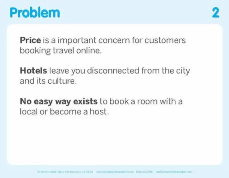
The second pitch deck slide consists of what problem you are solving. This can take form in what the opportunity is or what the pain your potential customers are feeling. Use social proof or a story to clearly demonstrate how potential customers are evaluating and solving the problem with current solutions vs. your solution.
The problem slide from Airbnb’s original pitch deck is a great example.
Related Reading: How to Write a Problem Statement [Startup Edition]
Pitch Deck Slide 3: Value Proposition
The third pitch deck slide should explain the value proposition that you are offering. This explains the direct value that your customers receive when choosing your product or solution. This is where your business pitch template will come in handy as you describe your value. Statistics, stories, and first hand data can be a valuable tool for the third slide.
Pitch Deck Slide 4: Your Differentiator
The fourth pitch deck slide explains what differentiates your solution than others in the market. Guy Kawasaki suggests using a visual pitch deck design here by using images, charts, and diagrams of your “secret sauce.” Instead of using text to explain the differentiator use visuals. If your secret is in the product, use this as an opportunity to show product screenshots or a demo video.
Pitch Deck Slide 5: TAM & Opportunity Breakdown
The fifth pitch deck slide should contain your business model. This shows how you are, or plan, to make money. The goal of this slide is to demonstrate the addressable market and portraying why your company has the ability to generate huge amounts of revenue to attract a large payout for the investors. Check out our Total Addressable Market Template to help get started with your TAM model.
Mathilde Collins, CEO of Front, has a great example of an opportunity in her Series C pitch deck. The slide clearly shows how the large the opportunity is (and later details how the Front product can win the market).

Pitch Deck Slide 6: Customer Acquisition and Go-to-Market
Being able to show a repeatable and efficient process for acquiring new customers is a must. Investors want to make sure that they will not be throwing their money down the drain. Going into a pitch with potential investors you need to understand your revenue model and go-to-market strategy like the back of your hand.
Make sure your GTM strategy slide is easily digestible and can be easily understood without added context.
One of the key metrics that investors will want to understand is your costs to acquire a new customer. (Learn more about CAC here).
It is important to demonstrate to your investors that your customer acquisition costs are less than your customer lifetime value. This will help showcase your path to profitability.
Ablorde Ashigbi is the Founder and CEO of 4Degrees. Earlier this year, Ablorde wrapped up a round of financing for 4Degrees. We went ahead and asked Ablorde what tips he has for founders looking to showcase their CAC in a pitch deck. His response:
- Don’t present CAC without a corresponding view of LTV
- Don’t present a blended CAC (including both organic and paid – only include conversions that came from paid channels)
- For earlier stage companies, payback period equally (maybe more) important than pure LTV / CAC
When it comes to presenting your GTM strategy and customer acquisition costs it all comes down to simplicity. An investor should be able to take a look at your slide and know exactly how your business functions.
The CAC slide from Vessel below is a great example.


Pitch Deck Slide 7: The Market
The seventh pitch deck slide should show what the market looks like. This includes your competitor landscape. Guy suggests that “the more the better” for this slide. If comparing yourself to competitors be sure to prepare for questions and conversation.
You shouldn’t be afraid to mention your competition in a pitch deck. If there are already players in the space, it proves that there’s a need to fill. Addressing your competition directly and sharing your competitive advantages is a way to assert confidence in investors that you truly understand the market.
Too often, though, pitch decks include a competitor slide, but don’t address how the startup will win against those competitors. A Gartner Magic Quadrant alone doesn’t get the job done—you need to convince investors that your company can be bigger and better than those that already exist in the market.
The competitive landscape from Airbnb’s original pitch deck is a great (and dated) example.

Pitch Deck Slide 8: The Team
The eighth pitch deck slide should be a highlight of your management team. Include a brief profile of your company’s managers and any other associated stakeholders. This can include your investors, board members, and advisors.
Related Resource: Crafting the Perfect SaaS Board Deck: Templates, Guidelines, and Best Practices
The team slide is included in almost every pitch deck example and outline, and for good reason—investors consistently say the team is one of the top criteria they look at when making an investment decision.
What often goes unmentioned, though, is how to structure the team slide so that it’s actually effective. A few headshots with names and titles underneath isn’t going to cut it. A good team slide not only covers the who, but the why, as in “why is this a team I should believe in?”
That means an effective team slide includes some context. Things like relevant experience in the market, previous startup exits, and key accomplishments are all worth including. If you have impressive advisors, include them, too. If an investor is deciding whether to fund you based on your team, you want to make the best argument for your team that you can.
An example of a great team slide is this one from Square. It’s a little dated now, but it does a good job providing some context for why the Square team was worth investing in, features logos to boost credibility, and includes advisors as well.

Pitch Deck Slide 9: Financial Projections & Key Metrics
The ninth pitch deck slide should contain your financial projections and key metrics. The key to building a business is generating revenue and having a financial plan to effectively scale and grow. Use a top-down, not bottoms-up, projection to wow your investors. A visual pitch deck design will also help here by using charts to make your projections easy-to-understand. To learn more about financial modeling and projections check out our guide here.
Related Resource: Important Startup Financials to Win Investors
If the founding team doesn’t take the top spot of what an investor care about, it usually goes to financials and metrics. And while investors want the full picture of your startup’s financial metrics before they invest, the pitch deck should really only include the highlights.
What investors want to see in financials is evidence of traction. What that means for your pitch deck is you should include a splash of metrics that are easy to digest and tell a good story. A few key metrics in a big, bold typeface beats a more thorough selection of metrics that are hard to parse.
This example from Moz’s Series B Round shows the impact of highly readable traction metrics that tell a good story:

Pitch Deck Slide 10: Timeline
The last pitch deck slide should be an overall timeline of your business. Where have you been in the past? What are the major accomplishments you’ve achieved so far? Where is your business headed and will the person you are pitching fit into this timeline? It is important to clearly showcase how you will deploy an investor’s capital to hit milestones and goals over the coming months, quarters, and/or years.
Front does a great job of showing where Front can be with the capital they need to grow into new markets.

Download our free pitch deck template here or below:
Related Resource: Pitch Deck Design Cost Breakdown + Options
Pitch Deck Examples
There are countless websites that share popular pitch deck examples from companies like LinkedIn, AirBnb, and Facebook. To help you put together the perfect pitch deck, we’ve laid out pitch deck examples from our favorite companies and the best pitch decks of 2018. You can find a library for pitch deck examples using this link.
LinkedIn Pitch Deck
One of our favorite pitch deck examples, the LinkedIn pitch deck is one of the original pitch decks that companies still look to today. While design and details have certainly changed since the 2004 LinkedIn pitch deck there are still relevant lessons and trends that have stood the test of time.
One of the most interesting aspects of the LinkedIn pitch deck is their ability to turn it into a compelling story. Keep in mind, at the time of this pitch deck, LinkedIn had zero revenue, were not leaders of a “hot market,” and had little to show for hypergrowth. Reid was aware that investors would have hesitations with LinkedIn’s lack of revenue so he steered immediately into their plan to generate revenue.
Instead of immediately jumping into their product, LinkedIn’s first slide is their 3 strategies for generating revenue. Now, it would be ill advised for a consumer facing company to show multiple revenue streams with no conviction in a single product. Luckily for LinkedIn, they launched all 3 products and were an exception. Regardless, Reid does a good job of addressing any push back that he’ll eventually see from investors for their lack of revenue.

One of the most interesting aspects of the LinkedIn pitch deck is their plain to become “Professional People Search 2.0.” LinkedIn’s main argument and reasoning for deserving venture capital, is the fact that the way people do professional research was inadequate and the market was ready for a new way to conduct professional research.
Ideally, the investors believed that professional people search was in need of a revamp. The next step in LinkedIn’s story is to show investors examples of the “1.0” to “2.0” jump in other companies Reid then offers examples of other markets and verticals that have been lifted going from “1.0” to “2.0.” Using analogies Reid was able to paint a picture of how LinkedIn can radically change the market just as his presented examples, Google, PayPal, and eBay, had done in the past. The LinkedIn pitch deck is a great example of how you can still build a compelling story with a lack of revenue and hypergrowth.

Facebook Pitch Deck
Another classic pitch deck example is Facebook’s pitch deck from 2004. The Facebook pitch deck comes from about the same time as the LinkedIn pitch deck as above. While it originally was not a pitch deck, rather a media kit, the original Facebook pitch deck has interesting examples that are worth mentioning. It is also fun to see how much Facebook has transformed from their original pitch deck to now.

The original Facebook pitch deck has a laser focus on the numbers. Covering everything from their own product to market data, Mark Zuckerberg uses data to tell the Facebook growth story. Facebook drills the stickiness and engagement with their product throughout the pitch and how Facebook can be a powerful advertising platform. While it may not tell as compelling a story as the LinkedIn pitch deck, the Facebook pitch deck is an example of a company using their growth metrics as the driving force of their pitch.
Pitch Deck Template by Guy Kawasaki
Guy Kawasaki is a marketing specialist. He worked for Apple in the 1980s and is responsible for marketing the original Macintosh computer line in 1984. Guy is infamous for coining the term evangelist in marketing. He might be most famous for his simple pitch deck template and the 10/20/20 rule of Powerpoint and pitch decks.
Guy Kawasaki was one of the earliest Apple employees and was largely responsible for marketing the original Macintosh. The pitch deck template by Guy Kawasaki has almost become a staple in the startup world. Simple, yet effective, the pitch deck template by guy kawasaki is a great starting point for any pitch. The pitch deck template is based off of a rule that Guy calls the 10/20/30 rule:
- 10 – A pitch should have 10 slides.
- 20 – A pitch should last no longer than 20 minutes.
- 30 – A pitch should contain no font smaller than 30 point font.
The presentation template by Guy Kawasaki embodies the idea that “less is more.” By having only 10 slides, you are forced to focus on the things that are absolutely necessary. A 20 minute pitch, allows time for discussion and is a reasonable amount of time for everyone involved to stay focused. 30 point font, makes sure that you and your audience are in sync. The pitch deck template by Guy Kawasaki is a great starting point for any point.
Airbnb Pitch Deck
Airbnb is one of the most infamous stories from Silicon Valley. From their radically different idea to their scrappy early stages the Airbnb story is filled with plenty of tips and stories for startups. The original Airbnb pitch deck has turned to one of the most popular pitch deck examples for companies to turn to. AirBed&Breakfast at the time of the Airbnb pitch deck, Airbnb is now on the path to an IPO with a value north of $30B. We’ve laid out a few of our favorite slides and ideas from the Airbnb pitch deck.
One of the first things that jumps out from the Airbnb pitch deck is on the first slide. The description, “Book rooms with locals, rather than hotels.” is straightforward and easy-to-understand. Airbnb clearly lays out what they do in the first 10 seconds of their presentation.

From here, Airbnb uses a good combination of market data and the problems that their users face to create a compelling story. The Airbnb pitch deck also does a good job of clearly stating how they generate revenue; “we take a 10% commission on each transaction.”
A common, yet well done, slide from the Airbnb pitch deck is the “Competition” slide. They use a common 2-axis diagram to show where they stand amongst their competition.

Just like everything else in the Airbnb pitch deck, the competition slide is easy to understand and you get an immediate grasp where Airbnb stands. Airbnb went on to raise $600k with the pitch deck. Their identity has obviously changed since their original pitch deck but the lessons and practices still stand today. We hope the slides laid out from the Airbnb pitch deck will help as you gear up for your venture raise.
While every business differs, the Guy Kawasaki pitch deck template is a great place to start. Lay out your pitch using his style and see what you think. From here you can tailor it to your businesses’ needs. Once you’ve got your pitch deck in place, it is time to kick off your fundraise.
Uber Pitch Deck
Starting as a daring idea, to raising $25B in venture capital, to being publicly traded with a $60B+ market cap, Uber is arguably the most famous VC backed company today. Just like any successful company, Uber was once a tiny startup doing their best to raise capital for their business.
Uber’s fundraising journey started in 2009 with a small $200,000 seed round. Since then, their original pitch deck has almost turned into a folklore. An almost ludicrous idea at the time has turned into everyday vocabulary across the globe. Even the founders of Uber had a limited understanding of how truly large their business could be back then. For example, their “UberCab” concept slide presents a black car type experience.

At the time, the only way to book an Uber was via SMS. How the times have changed!

One are that really sticks out is the total addressable market that Uber originally modeled. At the time, Uber shared that their original target market was $4.2B. In 2019, they almost tripled their original estimated market opportunity in revenue ($14B+). Although they were a niche service at the time and have expanded globally and horizontally in the market it is still shocking to look back at the opportunity they originally presented and how they’ve managed to dramatically change the market.
Related Resource: Check out our free guide and downloadable template, Our Favorite Seed Round Pitch Deck Template (and Why It Works)

Best Pitch Deck of the Past Year
The pitch deck examples above are great starting point but it is also good to get a look at more recent pitch deck.
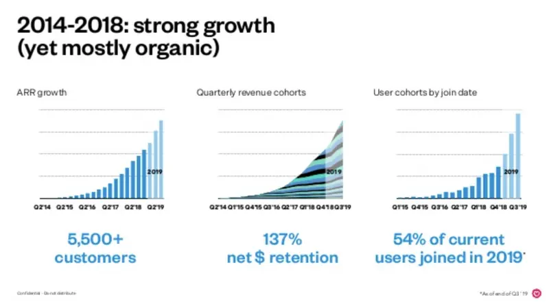
We have found the Front App pitch deck to be our favorite startup pitch deck of the past year. The pitch deck was used to raise Front’s Series C round. Front has certainly experienced hypergrowth — they’ve raised their Series A, B, and C since 2016. All of which were more than $10M. Luckily for other founders, Mathilde Collin, the CEO of Front, has made all of their pitch decks available to the public. While some founders may not be able to directly compare numbers to their Series C deck there are still a number of important takeaways.
The Mission
From the get-go of Mathilde’s pitch deck it is clear that Front is a mission driven company. The first 5 slides add a personal touch from Mathilde and clearly demonstrates that she, and her team, care deeply about the problem. This sets the stage for the story and kicks off a compelling pitch.

The Opportunity
Slide 6 shows just how huge the opportunity is. The market data is straightforward and jumps off the page. It clearly demonstrates that there is a huge market there that Front’s product can penetrate and become a successful exit for an investor.

The Metrics & Data
The metrics and data slide is one of the most impressive in the pitch deck. While it may be to difficult to compare to the actual data it is a powerful narrative for the pitch. Mathilde knows exactly where Front is world class and focuses on the data to portray why an investor should back their business. Simple and powerful.
Pitching your company is equal parts storytelling, data, and passion. To best pitch your company you need to personally understand why and how you are going to tackle a product, market, or problem. The next step is to truly understand what an investor looks for in an investment and how you can fit into their vision.
Putting together a pitch deck is only the start of a successful fundraise. You need to find the right investors, manage conversations, and distribute your pitch deck. To get started with your next fundraise check out our investor database to help you find your investors.
Related Resource: Best Practices for Creating a Top-Notch Investment Presentation
Looking for best practices for sharing your pitch deck? Check out our template for sharing your pitch deck here.
