How to Write a Cover Letter for Your Data Room

Matt Preuss
Marketing Manager

Why share a cover letter with your data room

Organizing and structuring a data room is important. As Elizabeth Yin of Hustle Fund wrote, “Impressive companies have everything organized, easy to find:

  • All documents are filed in the correct folders
  • All important documents are included
  • Everything is clearly labeled and easily searchable”

In addition to the contents of your data room, investors will use your data room to evaluate your organizational skills. To make sure investors can navigate and understand your data room, you need a clear structure and need to give investors the context they need to understand the contents.

A cover letter is a great way to introduce investors to your data room and explain its content and structure. Check out a cover letter template to get you started on your next data room below:

Cover letter example for your data room

Hello — Welcome to our seed stage data room! The purpose of this cover letter is to help you navigate our data room. As always, feel free to email me directly at [Email Address] or text me at [Phone Number.]

The video below should be a good starting point:

[Embedded 1-3 minute video explaining the layout and format of data room]

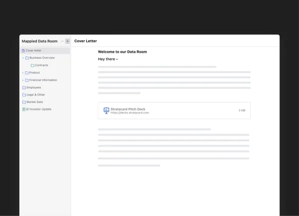
You’ll notice we have our data room broken down into X major folders:

  • Overview — This page, our most recent pitch deck, and other high level information.
  • Financials — Historical financial documents, statements, and projections for the next 12 months.
  • Cap Table and Financing Information — Our current cap table, founder stock purchase agreements, options plans, 409a valuation, etc.
  • Market Data — Market sizing activities and competitive landscape.
  • Incorporation Docs — Our bylaws, articles of incorporation, and more.
  • Team and Stakeholders — Current employee contracts, relevant experience, and info on current board members.
  • Milestones & Past Investor Updates — Take a look at our last 12 investor updates to see how we’ve grown and communicated the past year.
  • Product — A recent video recording of our product and a few testimonials from customers.

Thank you and let me know if you have any questions!

[Name]

Build and share your data room with Visible

At Visible, we oftentimes compare a fundraise to a B2B sales and marketing funnel. At the top of your funnel, you are finding new investors. In the middle, you are nurturing and pitching potential investors. At the bottom of the funnel, you are working through diligence and ideally closing new investors.

Beyond DocSend: Exploring Innovative Document Sharing Platforms for Modern Teams

With the introduction of data rooms, you can now manage every aspect of your fundraising funnel with Visible.

  • Find investors at the top of your funnel with our free investor database, Visible Connect
  • Track your conversations and move them through your funnel with our Fundraising CRM
  • Share your pitch deck and monthly updates with potential investors
  • Organize and share your most vital fundraising documents with data rooms

Manage your fundraise from start to finish with Visible. Give it a free try for 14 days here.

You may also enjoy:
Product Updates
Shaping the Future: Unveiling Our Brand Refresh
Visible started as a way for founders to update their investors but has since transformed into a purpose-built platform for both founders and investors. Since 2014, we’ve powered over 3M interactions between founders and investors. Our brand refresh represents our commitment to equip founders and the investors who back them. Founders can now manage their investor relationships and capital raises from start to finish. Investors can centralize data, uncover insights, and report to their LPs and stakeholders—all from one place. We are excited to unveil our refreshed brand, marking the beginning of the next decade in our dedication and commitment to founders and investors. Equipping Founders and Investors for Growth Raising capital is fundamentally about building relationships. Founders and investors spend months forging connections that, once solidified by a term sheet, can evolve into partnerships lasting 8 to 10 years and beyond. We set out to highlight the people behind the investments, not just the companies or firms they represent. As we continue to grow, you'll notice more familiar faces from different startups and venture funds featured on our site (👋 Hi Lacey!). Shaping Our Future Across our website and marketing assets, you’ll see 3D shapes floating in the background. While they add aesthetic appeal, they also carry a deeper meaning. For example: We believe raising capital from VCs or LPs closely resembles a fundraising funnel, a concept brought to life through the funnel shape that appears across various pages and assets. Sphere, torus, and pill shapes symbolize the connections between VCs, founders, and stakeholders, reflecting the interwoven nature of these relationships. These forms also symbolize forward momentum and the continuous progression within the venture ecosystem. As our product has evolved to offer greater flexibility in moving data into and out of Visible, you'll notice pipes integrated into the design, visually representing the seamless flow of data through our platform. Logo and Wordmark To maintain and perpetuate our brand equity, we opted to anchor our brand to our current logo and wordmark. The Visible logomark is made from three overlapping, equilateral triangles. Each triangle is slightly transparent, allowing the mark to interact with other design elements. These triangles represent human relationships and the connection between founders and investors, which is core to our mission and vision for our company. Color Palette Our signature black primary color remains, but we've refined our palette for a fresh look. We've transitioned from a complex, rich color scheme to a more cohesive and defined palette, creating a unified and bold approach to color across our brand. Introducing the new Visible color palette: Product Guided by our core values of trust and transparency, we designed our product to embody these principles. Our product visuals across the site are predominantly high-fidelity for the first time, highlighting its capabilities visually rather than relying solely on words. The updated typography and refined color palette are seamlessly integrated into our product screens, further enhancing the overall brand experience. Voice & Tone A brand is more than just its visual identity; it requires a voice and tone that harmonizes with its design. We aimed for our voice to be authentic, credible, and consistent, supporting both investors and founders alike. This commitment led us to define key principles for our voice and tone: Be a guide Less is more Recognize that different users face different challenges As you explore our marketing site, we hope Visible reflects these values and resonates with you. Transparency = Trust As we noted earlier, raising capital is fundamentally about relationships. Trust and transparency form the foundation of any strong connection. Throughout our website, you'll notice subtle transparency elements that embody this core principle. This new iteration of our brand is built to scale, but that doesn’t mean we won’t continue to evolve and elevate the experience for the betterment of our prospects and customers. Here's to shaping the next 10 years! Up and to the right,  The Visible Team
Product Updates
Product Update: Turn Emails Into Insights With Visible AI Inbox
Customer Stories
Case Study: Airtree Venture's Transformation with Visible
Fundraising
9 Tips for Effective Investor Networking