Case Study: How Render Capital Uses Visible to Streamline Fund Reporting

Belle Raab

Render Capital is a $30M early-stage VC fund with offices in Kentucky and Indiana. Led by Patrick Henshaw, Render has invested in 50+ companies as a part of its mission to create a robust and thriving regional economy where entrepreneurs see the Midwest and South as a place they can find appropriate risk capital necessary for them to start and grow.

For this case study, Visible interviewed Render Capital’s Operating Partner Mike Shepard.

Customer Story: How Render Capital Uses Visible to Streamline Fund Reporting

Watch the video below to learn why Render chose Visible to streamline their portfolio monitoring and reporting processes.

Prefer to read? Keep scrolling to read a paraphrased summary of Mike’s responses.

Q: How were you collecting data prior to using Visible?

Prior to Visible, Render was doing very little to collect data from companies because it was too time-consuming to do it via email and the process wasn’t very organized.

Q: What factors led you to choosing Visible?

We looked at other software to help with our fund management and the options seemed cumbersome, the relationships were tricky, and it seemed like it was actually going to be more work. I wanted to find a solution that let me pair our fund management alongside our own metrics so we could do our own reporting by creating dashboards and sharing those with LPs. We also liked that Visible helped collect reporting from our companies on a regular basis.

Q: What was the onboarding with Visible like?

I filled out a spreadsheet with our company and investment data. I prefer to be hands-on so the next step was just figuring out how to set up my own LP Update templates and reports. Visible was available to answer all my questions and the team was open to our feedback.

“It feels like we’re your only customer which is what you’re supposed to do.”

– Mike Shephard, Operating Partner at Render Capital

Q: What has been the result of using Visible

The results have been great. I created an LP Update template which we consider a marketing extension of our brand. To get this to look nice outside of Visible, in Excel, would have taken me a lot of time. I can use the template I created in Visible over and over again and it automatically updates. Our LPs are also really happy with the direction of our reporting and what we’re producing. We are getting our LPs the information that they want and need in a format that they can easily digest.

Over 350+ VC funds are using Visible to streamline their portfolio monitoring and reporting.

You may also enjoy:
Product Updates
Shaping the Future: Unveiling Our Brand Refresh
Visible started as a way for founders to update their investors but has since transformed into a purpose-built platform for both founders and investors. Since 2014, we’ve powered over 3M interactions between founders and investors. Our brand refresh represents our commitment to equip founders and the investors who back them. Founders can now manage their investor relationships and capital raises from start to finish. Investors can centralize data, uncover insights, and report to their LPs and stakeholders—all from one place. We are excited to unveil our refreshed brand, marking the beginning of the next decade in our dedication and commitment to founders and investors. Equipping Founders and Investors for Growth Raising capital is fundamentally about building relationships. Founders and investors spend months forging connections that, once solidified by a term sheet, can evolve into partnerships lasting 8 to 10 years and beyond. We set out to highlight the people behind the investments, not just the companies or firms they represent. As we continue to grow, you'll notice more familiar faces from different startups and venture funds featured on our site (👋 Hi Lacey!). Shaping Our Future Across our website and marketing assets, you’ll see 3D shapes floating in the background. While they add aesthetic appeal, they also carry a deeper meaning. For example: We believe raising capital from VCs or LPs closely resembles a fundraising funnel, a concept brought to life through the funnel shape that appears across various pages and assets. Sphere, torus, and pill shapes symbolize the connections between VCs, founders, and stakeholders, reflecting the interwoven nature of these relationships. These forms also symbolize forward momentum and the continuous progression within the venture ecosystem. As our product has evolved to offer greater flexibility in moving data into and out of Visible, you'll notice pipes integrated into the design, visually representing the seamless flow of data through our platform. Logo and Wordmark To maintain and perpetuate our brand equity, we opted to anchor our brand to our current logo and wordmark. The Visible logomark is made from three overlapping, equilateral triangles. Each triangle is slightly transparent, allowing the mark to interact with other design elements. These triangles represent human relationships and the connection between founders and investors, which is core to our mission and vision for our company. Color Palette Our signature black primary color remains, but we've refined our palette for a fresh look. We've transitioned from a complex, rich color scheme to a more cohesive and defined palette, creating a unified and bold approach to color across our brand. Introducing the new Visible color palette: Product Guided by our core values of trust and transparency, we designed our product to embody these principles. Our product visuals across the site are predominantly high-fidelity for the first time, highlighting its capabilities visually rather than relying solely on words. The updated typography and refined color palette are seamlessly integrated into our product screens, further enhancing the overall brand experience. Voice & Tone A brand is more than just its visual identity; it requires a voice and tone that harmonizes with its design. We aimed for our voice to be authentic, credible, and consistent, supporting both investors and founders alike. This commitment led us to define key principles for our voice and tone: Be a guide Less is more Recognize that different users face different challenges As you explore our marketing site, we hope Visible reflects these values and resonates with you. Transparency = Trust As we noted earlier, raising capital is fundamentally about relationships. Trust and transparency form the foundation of any strong connection. Throughout our website, you'll notice subtle transparency elements that embody this core principle. This new iteration of our brand is built to scale, but that doesn’t mean we won’t continue to evolve and elevate the experience for the betterment of our prospects and customers. Here's to shaping the next 10 years! Up and to the right,  The Visible Team
Product Updates
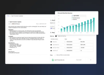
Product Update: Turn Emails Into Insights With Visible AI Inbox
Customer Stories
Case Study: Airtree Venture's Transformation with Visible
Fundraising
9 Tips for Effective Investor Networking