We last updated our brand identity in October 2020. Since then, Visible founders have gone from sending 8,000 investor updates per month to over 75,000 — we also launched Visible Pitch Decks and Data Rooms.
We’ve learned first hand that building a startup is difficult. Most founders take a major risk to invest their time, money, and careers to build something. At Visible, we want to better celebrate the thousands of founders doing the difficult. We’ve been on the sidelines watching these founders grow while our own team, product, and organization has grown.
In order to reflect these efforts, we are excited to roll out our new brand direction that supports this new phase for Visible

Putting Visible Founders First
In order to put founders first with everything we do at Visible, we wanted to showcase their individual stories and experiences across our marketing efforts. You will notice individual founder headshots, stories, and quotes across the website.
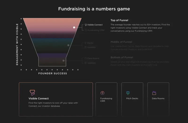
Data and Stories to Help the Next Set of Founders
Thousands of founders use Visible every month to update their current investors, share their pitch decks, build their data rooms, and manage their fundraising efforts. In order to help the next generation of founders using Visible, we want to highlight the first-hand data and best practices we’ve uncovered.
Color, Gradients, and a New Font to Bring Life to Our Brand
While difficult, building a startup should be lively. In order to better recognize the highs of building a startup and align with our guiding principles we wanted to refresh our brand.
Logo
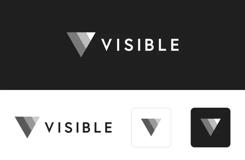
Our logo is staying and is the anchor to our brand. The Visible logomark is made from 3 overlapping, equilateral triangles. Each triangle is slightly transparent, allowing the mark to interact with other design elements. These triangles represent human relationships and the connection between founders and investors.
Brighter colors & gradients
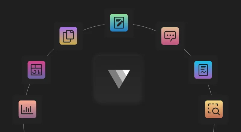
Our black isn’t going away either, but are using the same color palette from our application to bridge the gap between our product and brand. You will see brighter, more vibrant colors in our product screens to bring those metrics to life. We have also added gradients across our website to enhance some elements like our product screens and call attention to our informational graphs.
Bridging the Product & Go to Market Gap
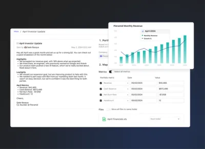
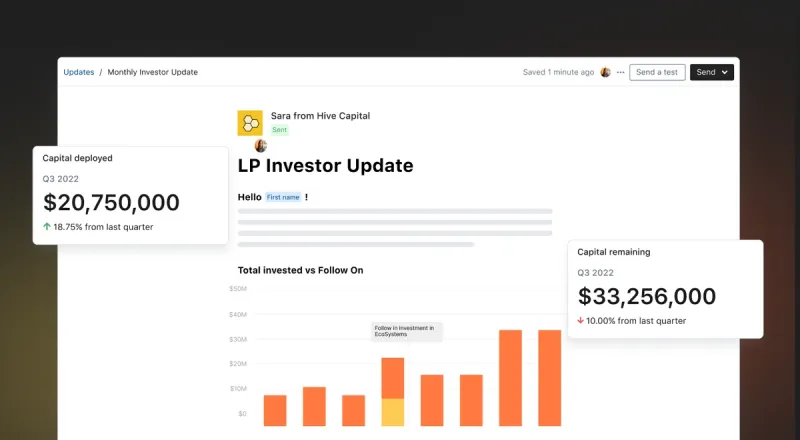
We wanted to bring the same sleek and modern feel from our product to our marketing efforts. In order to do so we’ve changed our serif font to a san serif font. Across our website, you will notice product screens that show our product in a more realistic approach.
