Our New Chart Builder Colors
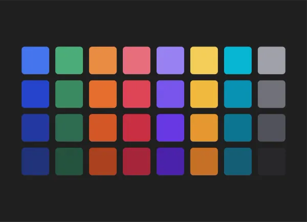
We recently added 3 new color palettes to our color picker in the chart builder. The first row of colors (which have always been in place) are from the original Visible color palette. They’re what you would currently see in any Visible charts presuming you haven’t changed the default colors (and let’s be honest – nobody changes the defaults!).
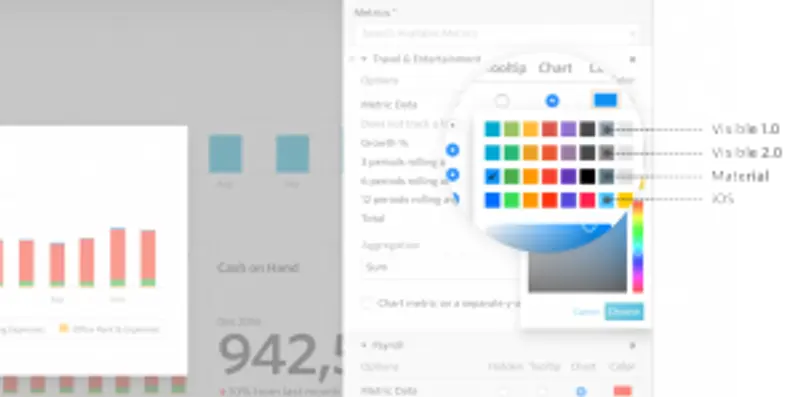
But in case you’ve been looking for an easier way to brighten up your charts, we’ve added 3 new color palettes. The 2nd row is inspired by Visible 2.0 and reflects the more modern colors we use throughout our app. The 3rd color palette is inspired by the simple and smart colors of Google’s Material design. The 4th is inspired by the bright colors of Apple’s iOS. It’s best to coordinate on one color palette for a Dashboard. So if you’re going for the blue in Material, it’s best to use the green in material for your next chart. We plan to make it easier to ‘Choose a theme’ so you can easily stick to the color palette of your choice in the future but in the meantime this should help!
