It’s never been easier to get started on the pitch deck for your startup. There is no shortage of pitch deck examples online, and pitch deck best practices are ubiquitous as well.
Despite a wealth of available knowledge on the subject, creating a pitch deck is still challenging work. A great pitch deck is concise, but thorough, informative, but not boring, simply designed, but with personality. It’s little wonder creating them causes so much stress. At Visible, we spent a good 20 hours iterating on our most recent pitch deck, and we’re still not sure we have it “right.”
No matter what outline or template you use, there are a few slides that you should pay extra attention to. These are the slides that can make or break your pitch deck, so take the time to make sure they’re right. Check out the slides below:
The Cover Slide
This one feels obvious, but so many startups get it wrong that it’s worth calling out. In this list of 30 “legendary” pitch decks, maybe ¼ of them get the cover slide right.
The most important thing to remember when making your cover slide is this is often your first impression with the investors you’re pitching. These are investors who have seen a lot of pitches, so getting their interest and attention quickly is important. Your cover slide is your best shot at doing that.
So what makes a great cover slide? Just a few important elements:
-
- Sharp design. If there’s a slide to fuss over, design-wise, it’s this one. Remember, you’re making a first impression here. Good design is key.
- Your logo. Obviously.
- What you do (or tagline). This is the element that is most often omitted, but it’s critical. You want to provide context right away, orienting the listener to what your business is all about. Don’t get cute here—the more straightforward, the better.
- Contact info. This is especially important when you’re sending the deck via email before or after the pitch. You want the names of the people who are pitching, some direct contact info (probably email) and a place online where the investor can learn more about you, whether that’s your home page or a social media profile.
As I mentioned, a lot of startups get this slide wrong. A good example is the cover slide from SteadyBudget, which is now Shape.io.

The Team Slide
The team slide is included in almost every pitch deck example and outline, and for good reason—investors consistently say the team is one of the top criteria they look at when making an investment decision.
What often goes unmentioned, though, is how to structure the team slide so that it’s actually effective. A few headshots with names and titles underneath isn’t going to cut it. A good team slide not only covers the who, but the why, as in “why is this a team I should believe in?”
That means an effective team slide includes some context. Things like relevant experience in the market, previous startup exits, and key accomplishments are all worth including. If you have impressive advisors, include them, too. If an investor is deciding whether to fund you based on your team, you want to make the best argument for your team that you can.
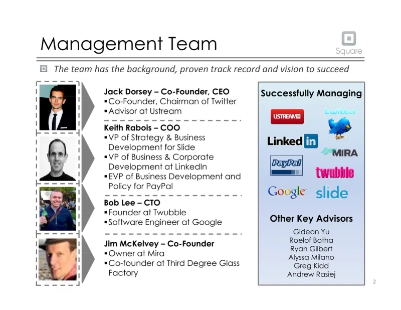
An example of a great team slide is this one from Square. It’s a little dated now, but it does a good job providing some context for why the Square team was worth investing in, features logos to boost credibility, and includes advisors as well.
The Metrics Splash

If the founding team doesn’t take the top spot of what an investor care about, it usually goes to financials and metrics. And while investors want the full picture of your startup’s financial metrics before they invest, the pitch deck should really only include the highlights.
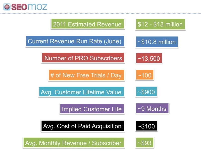
What investors want to see in financials is evidence of traction. What that means for your pitch deck is you should include a splash of metrics that are easy to digest and tell a good story. A few key metrics in a big, bold typeface beats a more thorough selection of metrics that are hard to parse.
This example from Moz’s Series B Round shows the impact of highly readable traction metrics that tell a good story:
The Competition

You shouldn’t be afraid to mention your competition in a pitch deck. If there are already players in the space, it proves that there’s a need to fill. Addressing your competition directly gives you credibility and demonstrates that you’re familiar with the market.
Too often, though, pitch decks include a competitor slide, but don’t address how the startup will win against those competitors. A Gartner Magic Quadrant alone doesn’t get the job done—you need to convince investors that your company can be bigger and better than those that already exist in the market.
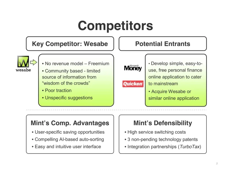
Mint did this well in one of their early decks by not only including a competitor breakdown, but also sections for competitive advantages and defensibility:

As difficult as it can be to get your pitch deck to a place you’re happy with, if you focus on doing these key slides well, you’ll be firmly on the path to having a deck you can present with confidence. For more startup tips and advice, make sure you’re subscribed to The Founder’s Forward, our weekly email that helps you grow your startup.


