3 Key Takeaways from our Series A Webinar

Andrew Clark

Last week, we hosted a webinar on how to raise a Series A. In it, Zylo CEO & Co-Founder Eric Christopher and I shared tactics and advice on how to make sure your Series A raise is a successful one. If you made it, thanks! We had a great turnout of engaged audience members. If you weren’t able to make it, you can check out the recording below:

Today, I want to share three key takeaways from the webinar, in the hopes that they might help you raise your next funding round.

How to know if you’re ready to raise?

Series A readiness is a difficult thing to pin down. So much depends on your specific situation: the industry you’re in, the product you’ve built, your business model. A good breakdown of specific numbers you should be hitting can be found here, but even that list isn’t universal.

As a general rule, though, you’ll know you’re probably ready to raise your Series A when you have these three things: an engine, healthy metrics, and a compelling story to tell.
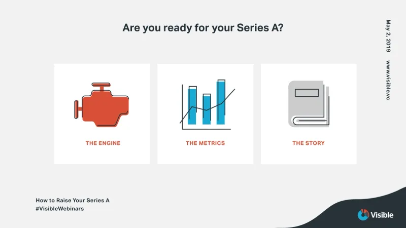
“An engine” refers to a predictable engine for acquisition. Acquisition of what, exactly, will depend on your company; it could be users, customers, revenue, etc. The important thing is, do you have a predictable way to acquire more?

Healthy metrics refers to three general patterns: accelerated growth, low churn, and efficient acquisition. If your metrics demonstrate all three of these things, you’ll be very attractive to potential investors.

The third item is this: can you tell a compelling story? This is potentially the most important item of the three. Every investor wants to invest in a good story. If you can effectively communicate what you’ve done so far, then paint a clear picture of what the future will look like if you keep succeeding, you’re likely to have success with your raise. If an investor likes the sound of that future and they believe you can make it happen, they’ll invest.

Before you raise, commitment is key

If you think your company is ready to raise a Series A, the first thing you have to do is prepare yourself. You have a lot of hard work ahead of you.
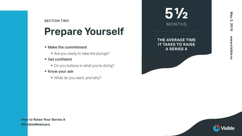
A Series A raise takes, on average, about 5.5 months to complete. That’s a lot of time where your focus will be outside of the day-to-day of your business. You’re also going to face a lot of rejection—the most common answer after pitching an investor, after all, is “no.”

A CEO/Founder who is undertaking a Series A round needs to be fully prepared to do so—committed to seeing it through, confident in their pitch, and always working with a specific goal in mind. Before diving into your Series A raise, you need to make sure you’re prepared for what it means.

Don’t forget about your current investors

Your current investors can be absolutely essential in closing your Series A round—whether they participate in the round or not.
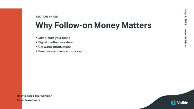
If your current investors choose not to follow on—for whatever reason—they can still be a huge help to you as you raise your round. They can provide everything from pitch feedback to warm introductions to other investors who might be a better fit.

These are just three takeaways from our webinar on raising your Series A round, but there’s plenty more content where that came from. Check out the recording below:

You may also enjoy:
Product Updates
Shaping the Future: Unveiling Our Brand Refresh
Visible started as a way for founders to update their investors but has since transformed into a purpose-built platform for both founders and investors. Since 2014, we’ve powered over 3M interactions between founders and investors. Our brand refresh represents our commitment to equip founders and the investors who back them. Founders can now manage their investor relationships and capital raises from start to finish. Investors can centralize data, uncover insights, and report to their LPs and stakeholders—all from one place. We are excited to unveil our refreshed brand, marking the beginning of the next decade in our dedication and commitment to founders and investors. Equipping Founders and Investors for Growth Raising capital is fundamentally about building relationships. Founders and investors spend months forging connections that, once solidified by a term sheet, can evolve into partnerships lasting 8 to 10 years and beyond. We set out to highlight the people behind the investments, not just the companies or firms they represent. As we continue to grow, you'll notice more familiar faces from different startups and venture funds featured on our site (👋 Hi Lacey!). Shaping Our Future Across our website and marketing assets, you’ll see 3D shapes floating in the background. While they add aesthetic appeal, they also carry a deeper meaning. For example: We believe raising capital from VCs or LPs closely resembles a fundraising funnel, a concept brought to life through the funnel shape that appears across various pages and assets. Sphere, torus, and pill shapes symbolize the connections between VCs, founders, and stakeholders, reflecting the interwoven nature of these relationships. These forms also symbolize forward momentum and the continuous progression within the venture ecosystem. As our product has evolved to offer greater flexibility in moving data into and out of Visible, you'll notice pipes integrated into the design, visually representing the seamless flow of data through our platform. Logo and Wordmark To maintain and perpetuate our brand equity, we opted to anchor our brand to our current logo and wordmark. The Visible logomark is made from three overlapping, equilateral triangles. Each triangle is slightly transparent, allowing the mark to interact with other design elements. These triangles represent human relationships and the connection between founders and investors, which is core to our mission and vision for our company. Color Palette Our signature black primary color remains, but we've refined our palette for a fresh look. We've transitioned from a complex, rich color scheme to a more cohesive and defined palette, creating a unified and bold approach to color across our brand. Introducing the new Visible color palette: Product Guided by our core values of trust and transparency, we designed our product to embody these principles. Our product visuals across the site are predominantly high-fidelity for the first time, highlighting its capabilities visually rather than relying solely on words. The updated typography and refined color palette are seamlessly integrated into our product screens, further enhancing the overall brand experience. Voice & Tone A brand is more than just its visual identity; it requires a voice and tone that harmonizes with its design. We aimed for our voice to be authentic, credible, and consistent, supporting both investors and founders alike. This commitment led us to define key principles for our voice and tone: Be a guide Less is more Recognize that different users face different challenges As you explore our marketing site, we hope Visible reflects these values and resonates with you. Transparency = Trust As we noted earlier, raising capital is fundamentally about relationships. Trust and transparency form the foundation of any strong connection. Throughout our website, you'll notice subtle transparency elements that embody this core principle. This new iteration of our brand is built to scale, but that doesn’t mean we won’t continue to evolve and elevate the experience for the betterment of our prospects and customers. Here's to shaping the next 10 years! Up and to the right,  The Visible Team
Product Updates
Product Update: Turn Emails Into Insights With Visible AI Inbox
Customer Stories
Case Study: Airtree Venture's Transformation with Visible
Fundraising
9 Tips for Effective Investor Networking